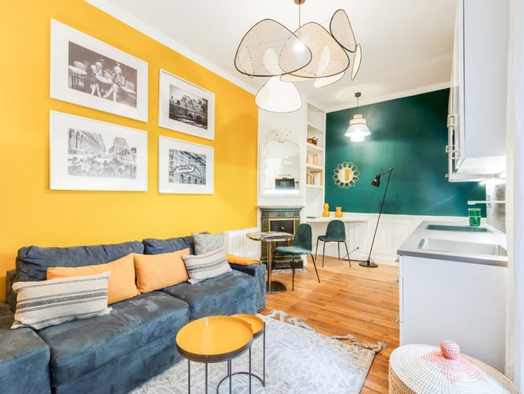
A colorful two-piece, converted at a low price © Holborn Studio
No major work here, but an interior that has nevertheless been transformed. This Parisian two-piece has indeed changed its look thanks to a skilful work on color and decoration. Cleverly designed home staging for an inexpensive converted apartment.
Sometimes it doesn’t take much to transform an interior. This 35 m2 Parisian has changed its face thanks to a few touches of color cleverly dispatched, which made it possible to give it character and create a warm atmosphere. “The apartment was in good condition. The rooms were well distributed and it had pretty moldings and a beautiful old fireplace. The idea was to give it a little fresh air and give it an identity” explains Paul Montserret of the Holborn Studio agency, to whom the owners have entrusted their renovation project. The interior designer therefore drew from a palette of bright colors to structure the different living spaces, but also bring light. “The apartment is located on the first floor and has only one window facing the courtyard in the living room. The objective was therefore also to bring some light back into the room“. The wall behind the sofa, which the previous occupants had painted red, has thus been dressed in a very bright yellow, which blends perfectly with the blue of the corridor. The private spaces, on the contrary, have been lit in light shades, full of softness. Thus transformed, the apartment now has everything of a small welcoming and warm cocoon. Paul Montserret knew highlight existing elements while bringing a little touch of modernity. “The idea is to go fast enough, to do something simple but visually striking and in tune with the times”. Visit in pictures.
A colorful entrance
A colorful entrance © Holborn Studio
Hemmed in a deep shade of blue, the entrance sets the tone. To give it a real personality, the interior designer has opted for a strong color that leads the visitor to the living room. He also reworked the lighting to ensure sufficient light. “The base also creates a play of contrast and allows you to drive, to guide the steps towards the living room” says Paul Montserret.
A colorful entrance
Solar yellow in the living room
Solar yellow in the living room © Holborn Studio
“We had to compose here with the kitchen and the sofa. For budget reasons, we did not touch them, and the options were limited in terms of reconfiguring the space” indicates the interior designer. Here again, he therefore relied on color and a paint job to transform the room. “The wall behind the sofa was painted red. We opted for a very bright yellow, which lights up the whole room”.
Solar yellow in the living room
Old elements highlighted
Old elements highlighted © Holborn Studio
Paul Montserret has also taken care to highlight the old elements which contribute to the charm of the apartment. The moldings were thus dusted and repainted in white with the ceiling. The parquet, rather dark, was sanded to lighten it then revitrified. “The old fireplace has also been cleaned to give it a little boost”.
Old elements highlighted
Natural materials to warm the atmosphere
Natural materials to warm the atmosphere © Holborn Studio
“Even if the colors are different, we tried to create a unit in the apartment, with nuances and natural materials. There is a lot of canework for example, in the light fixtures, but also in the TV cabinet which has been changed. . We chose linen curtains, there are also small rattan mirrors here and there “. details Paul Montserret. So many small details that help warm the apartment.
Natural materials to warm the atmosphere
A brighter room
A brighter room © Holborn Studio
The walls of the bedroom were painted gray. To bring a little more light into the room, and create a softer atmosphere, the interior designer chose light colors. As in the living room, there are several elements in cane and linen.
A brighter room
A room designed like a cocoon
A room designed like a cocoon © Holborn Studio
“The bedroom had a dressing room, closed with large mirror doors. To break this shiny, very cold side, the doors were replaced by curtains, softer to the eye and warmer” indicates the interior designer. The room is bathed in a cozy atmosphere, which makes it a cozy little cocoon.
A room designed like a cocoon
A cleverly illuminated bathroom
Skillfully illuminated bathroom © Holborn Studio
The bathroom was dressed in charcoal gray, which darkened the room considerably and narrowed the space. Paul Montserret therefore repainted walls and cupboards in a light shade to let in light and create an impression of volume. He also replaced the suspension and hung a new mirror. For the rest, he relied on the strengths of the bathroom. “The floor, with its pretty cement tiles, has been preserved, as well as the washbasin cabinet”.
Technical sheet
Project: complete home staging of a two-room apartment Location: Paris, 3rd arrondissement Area: 35 m2 Construction: Holborn Studio (www.holborn.fr) Duration of the work: approximately 2 months (study, design and construction) Budget: € 10,000
A cleverly illuminated bathroom


