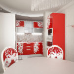
If you like this proposal, you just have to find out in more detail how to choose and compose compositions that fit perfectly into the overall design solution of this room.
Pictures in the interior of the kitchen, as you can see in the photo, will become a bright decorative decoration. Our tips will help you make your home special.
Balance paintings
When choosing pictures for your wall composition, first of all proceed from the principle of balance.
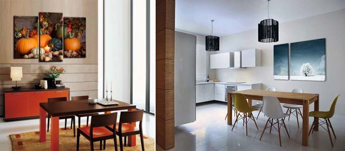
In particular, if you are placing some kind of bright canvas at the top of the group, pick up one or more images in a similar color scheme in order to place them at the bottom.
Such a solution will make the composition harmonious and complete.
Plots and color palette of the interior
The plots of paintings for the kitchen can be very different, from still lifes to abstraction. It follows from the interior style of your room.
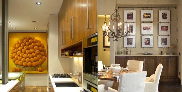
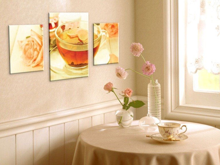
Provence kitchens will benefit from floral prints.
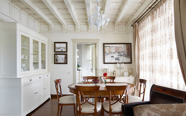
Classic options can be safely supplemented with landscapes and portraits painted in oil.
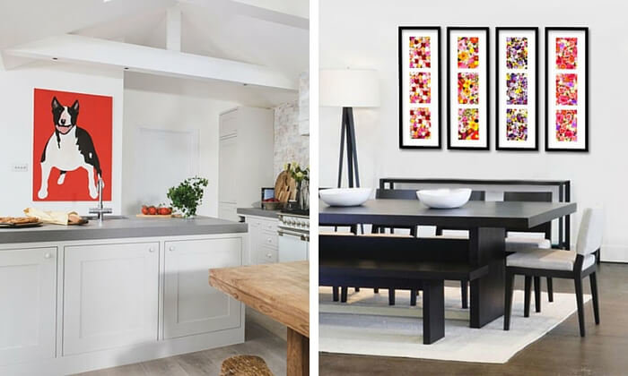
Modern high-tech, modern and minimalist spaces can be brought to life with abstract paintings, black and white photographs or pop art canvases.
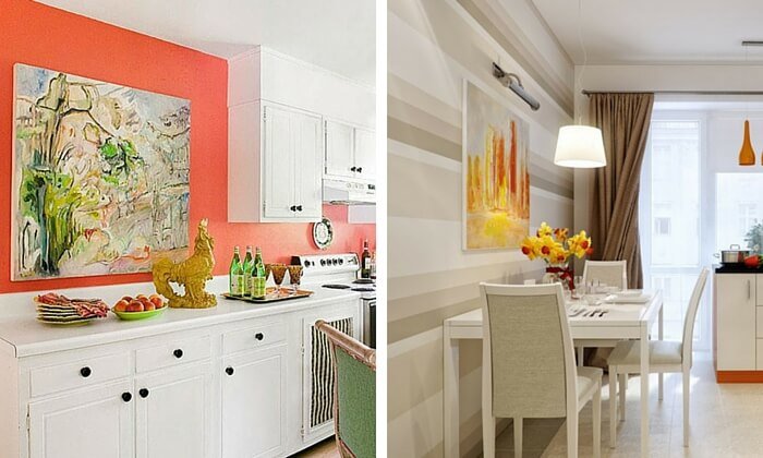
It is worth following the interior style even if you decide to choose images for yourself on a culinary theme.
Provence-style kitchens can be decorated with, for example, posters on the theme of a retro French bakery ad. At the same time, still lifes can be ideal for classical solutions.
The color scheme should be selected in strict accordance with the general tone of the walls, the color of the work apron, furnishings, modern curtains.
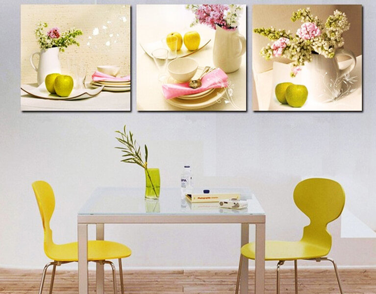
Nobody has canceled the key rules of shade compatibility.
Unity of decor
If you are choosing more than one painting for yourself, but several, it is important to achieve the unity of the composition.

It does not matter in what sequence the canvases will be hung, the main thing is the presence of a certain similarity between them.
This could be:
• color spectrum;
• semantic meaning;
• image style;
• frame design.
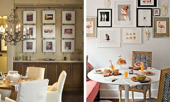
It is the last method that is the easiest in creating the unity of such a decor.
Composition form
Pictures in the interior of the kitchen, according to the above photos, are very often arranged so as to imitate a fragment of the wall on which they hang.
Such a solution will look most advantageous in strict, respectable or minimalist interiors.
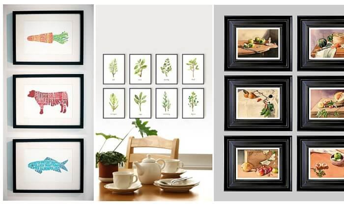
The paintings do not have to be the same size, you just need to make the correct layout (rectangle or square).
If the design idea is to create an atmosphere of lightness and ease, arrange the canvases in a chaotic manner.
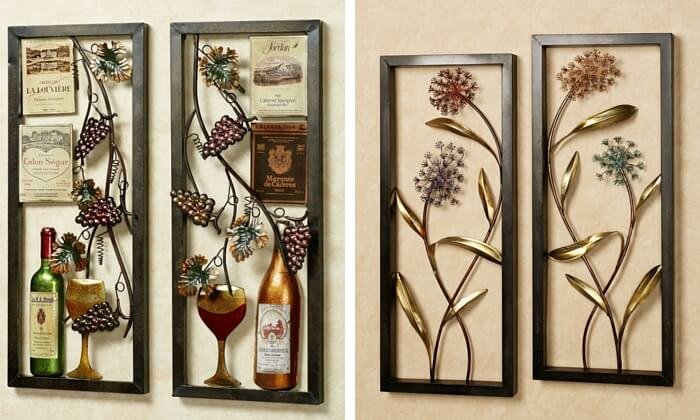
Such a solution will be especially effective in country or shabby chic kitchens.
It is not necessary to initially mount paintings on the walls. Play around with their layout on the floor.
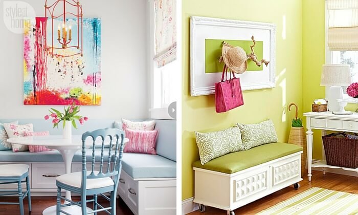
It would be useful to trace their outlines on paper, cut and place on the wall. Thanks to this approach, you will be able to visualize the end result.
Size matching
A small picture on a large wall will look just as out of place as a large picture on a small one, that is, proportions should be observed.
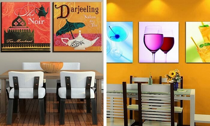
It is also important to take into account the height of the ceilings.
If your kitchen is short, but long, then place an elongated group of canvases on a free wall.
While on high, a wide composition or one large image will look impressive.
Horizontal and vertical placement of paintings
The simplest arrangement of paintings is realized following a vertical or horizontal axis. Just find the center of each canvas and place them in rows.
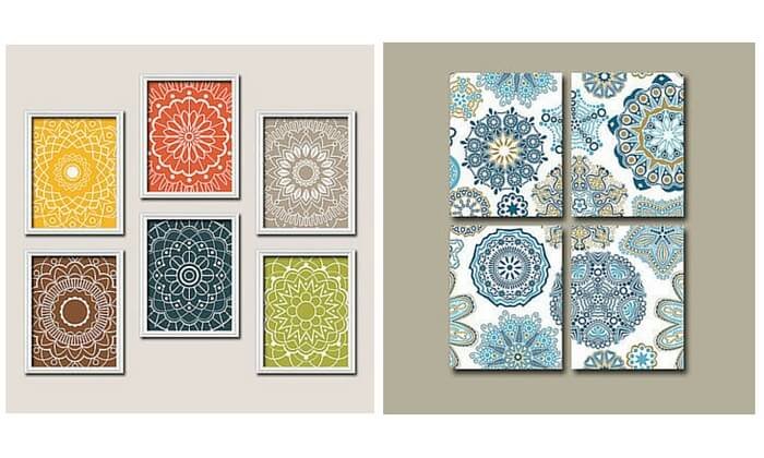
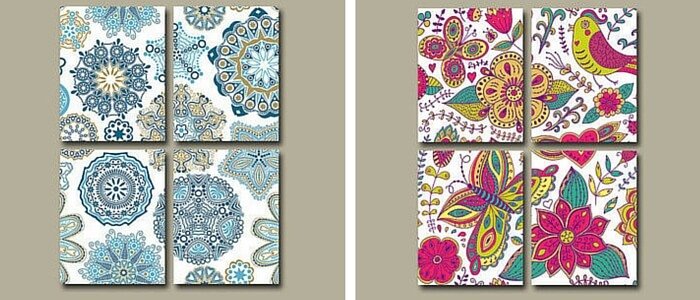
This is a universal solution for kitchens made in any interior design.
Place for paintings
It is better to place pictures in well-lit areas of the kitchen, but not in direct sunlight, because in the shade the details of the drawings will be indistinct, therefore they will not be able to be perceived properly.
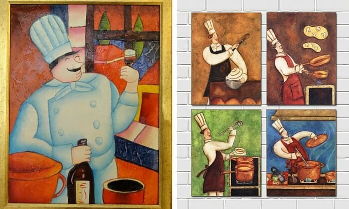
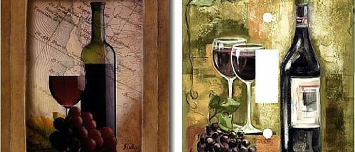
If your room is located on the north side, then pick up canvases with a large and clearly visible image. Also, the way out of this situation can be the illumination of the ceiling or paintings.
Height at which paintings should be placed
A drawing located at eye level will be perceived best.
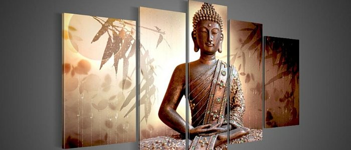
If you hang pictures on more than one wall, be sure to make sure that their bottom edges are on the same level.
Small canvases can be raised or lowered somewhat below eye level, while large canvases should be hung so that the bottom does not fall below the middle of the wall.
Taking into account all these nuances, you can create a holistic, harmonious image with a bright personality and uniqueness.


