Welcome to our updated post How not to overdo it with green?
.
Green is perfect for absolutely all areas in the house. Being in the interior of a green kitchen, a person rests and feels peaceful. This color has a relaxing effect and has been found to improve mood.
Opticians have found that, unlike other colors, the eye rests on a green one. According to the Chinese doctrine of Feng Shui, which states that color affects mood, green is also considered soothing.
Interior in detail
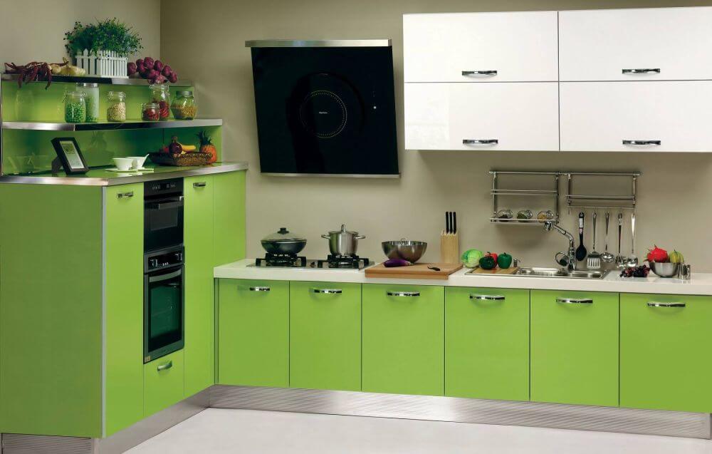
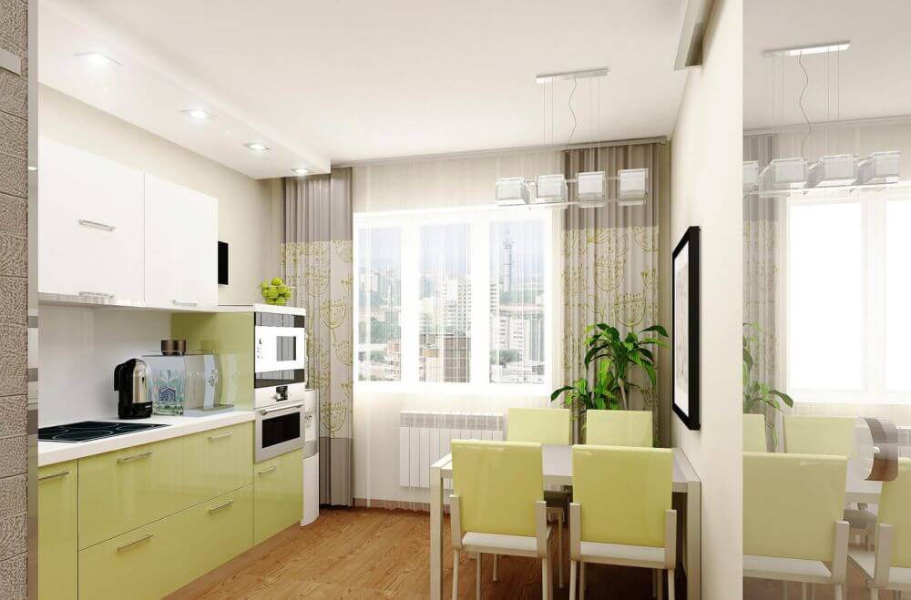
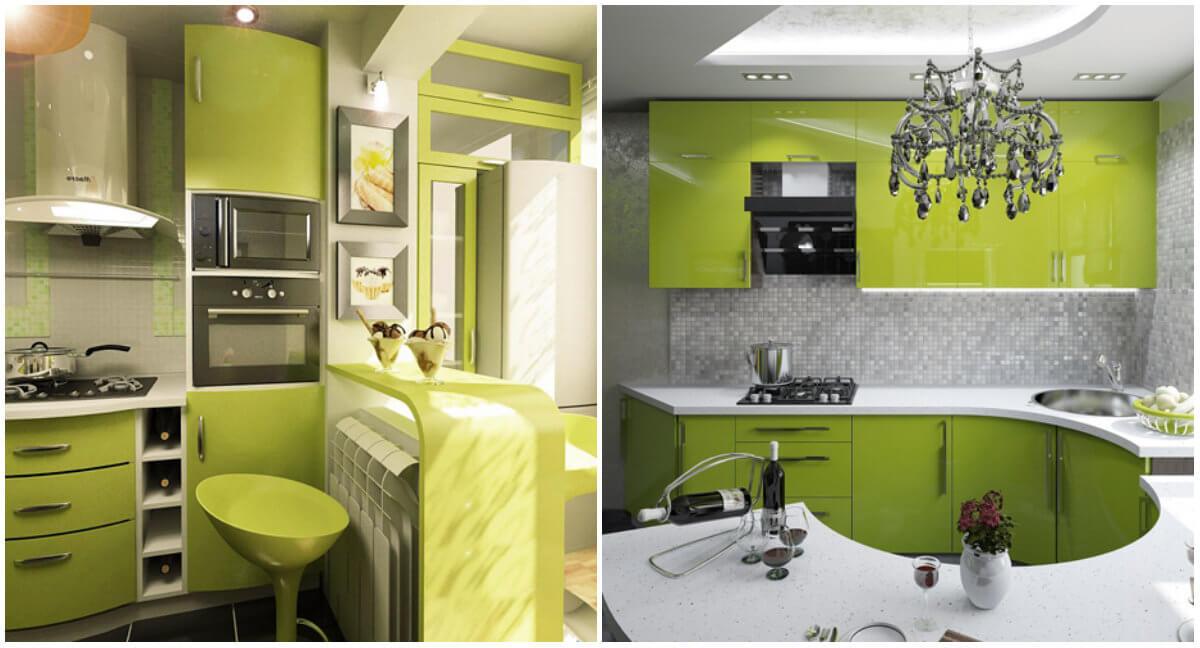
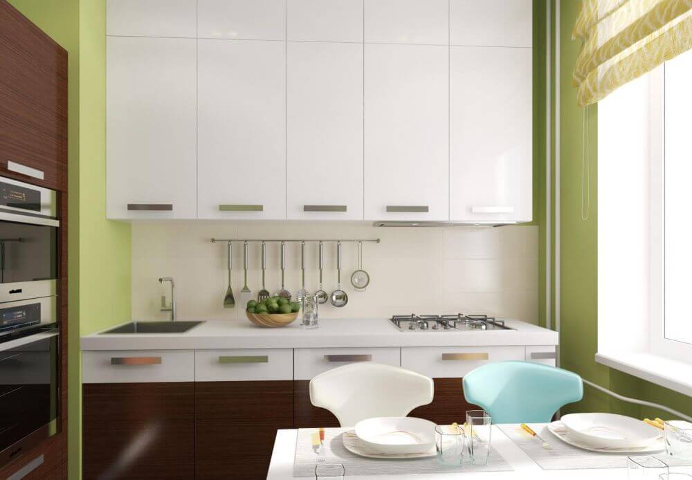
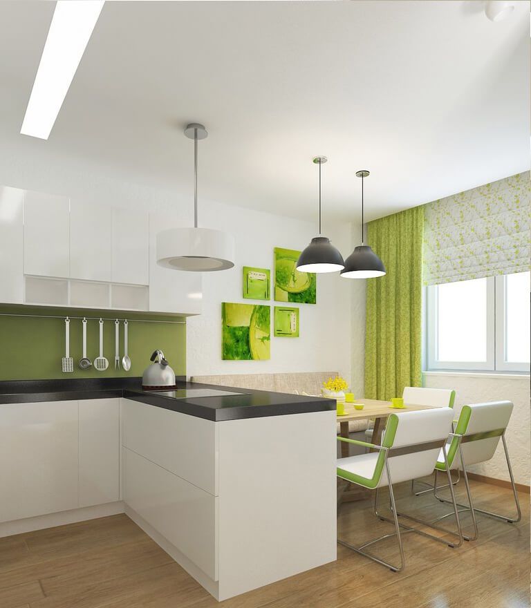
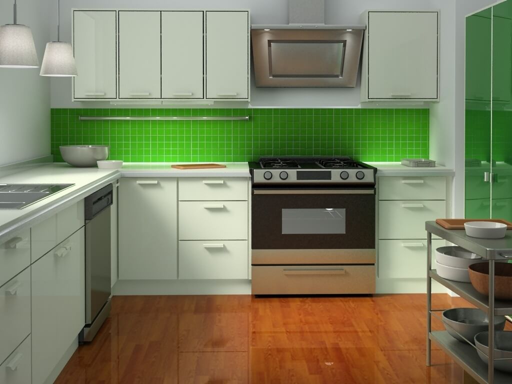
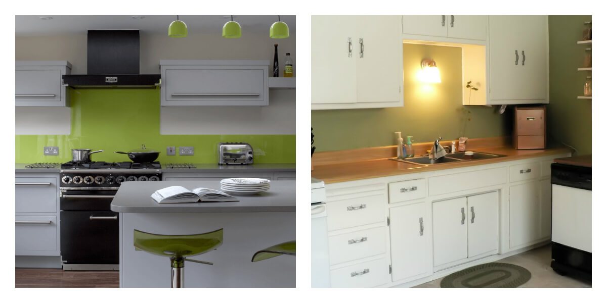
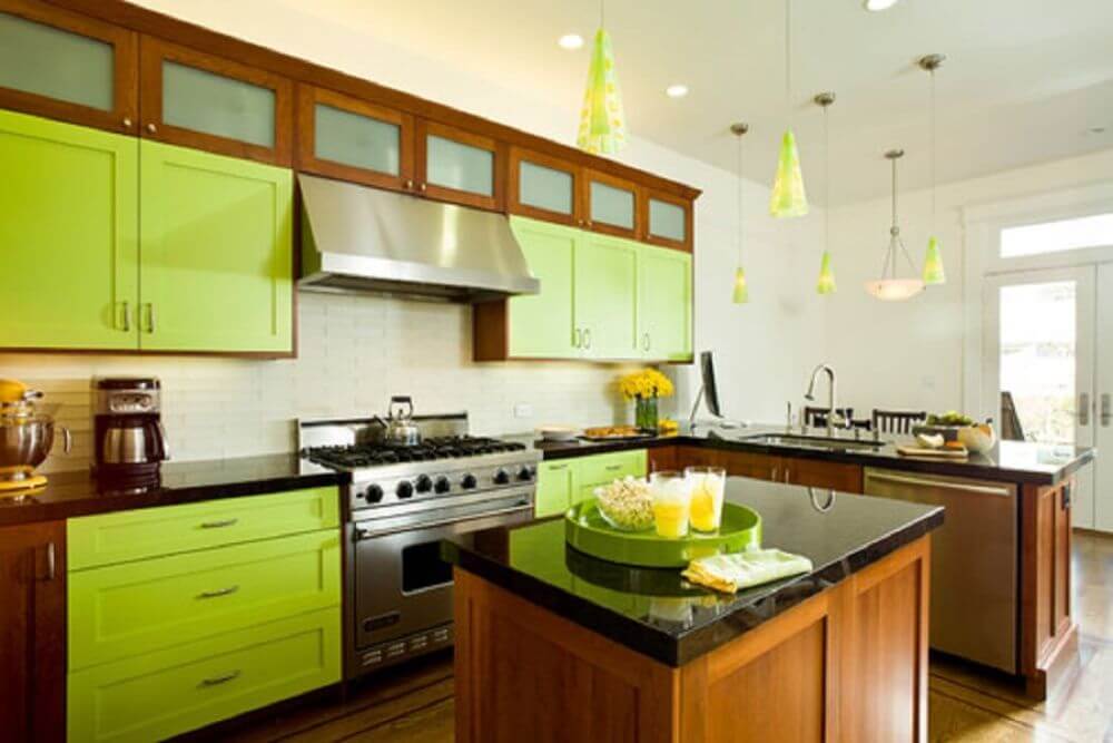
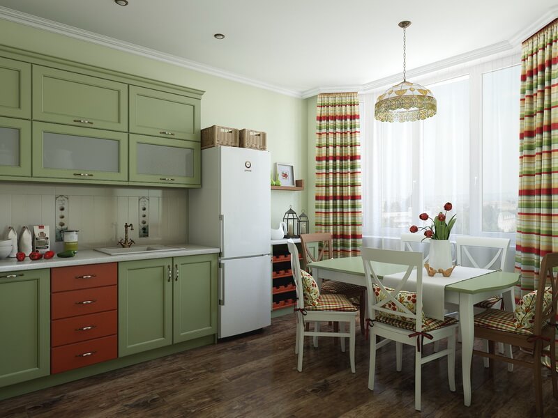
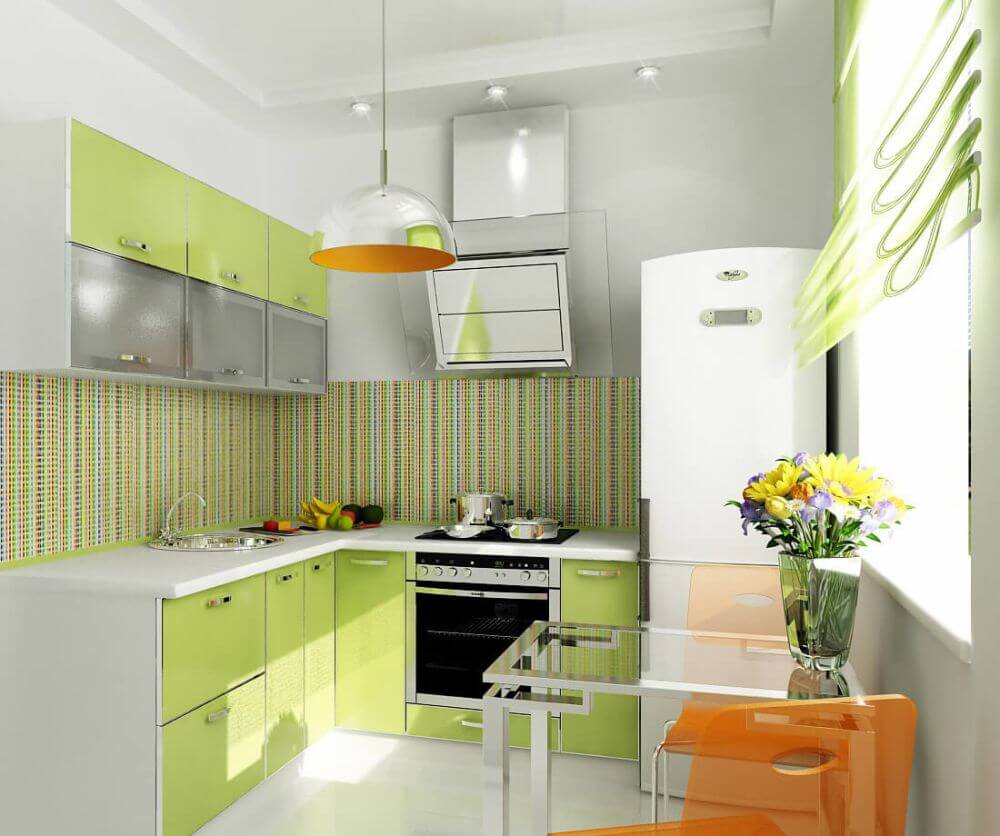
The photo shows a green kitchen in a modern style. Simple and clear lines create a laconic image of the entire interior.
Kitchens of this color can be very different: in modern and traditional styles, bright colors and pastels. Everyone can find their ideal interior and bring it to life. We offer you various design options and photos with examples of green kitchens.
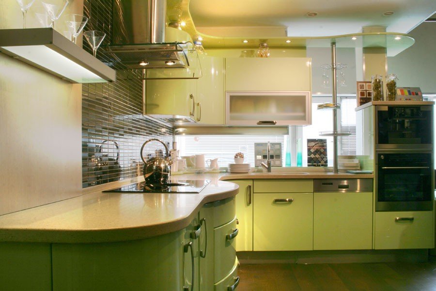
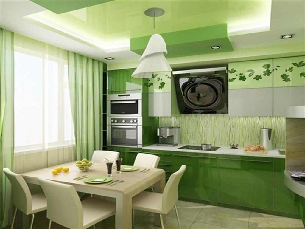
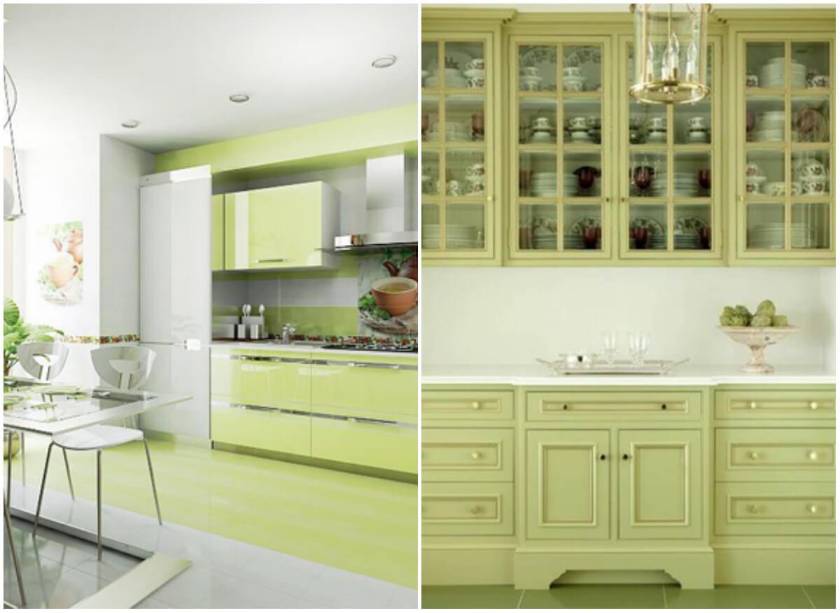
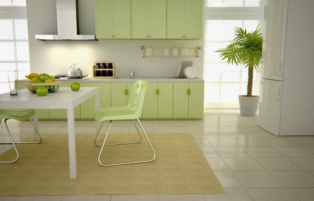
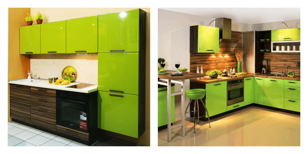
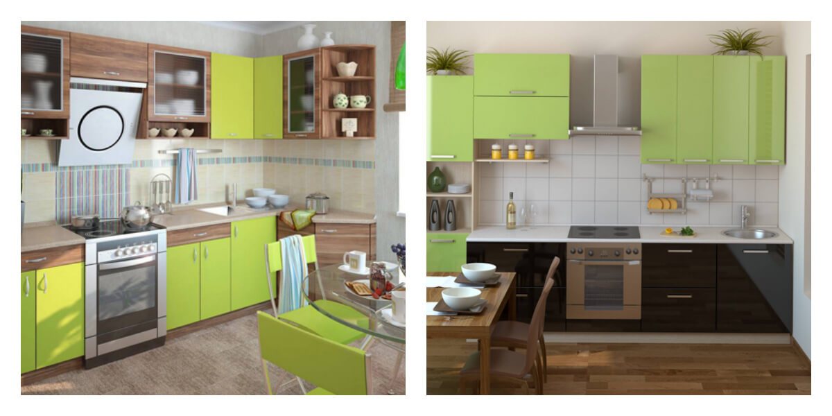
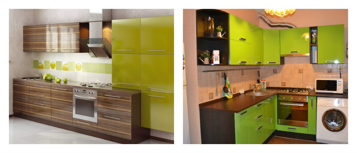
Green headset… Perhaps the most important design element in any kitchen is its furniture. Today you can find and choose a set in any style: from high-tech with glossy facades to romantic Provence with wooden cabinets.
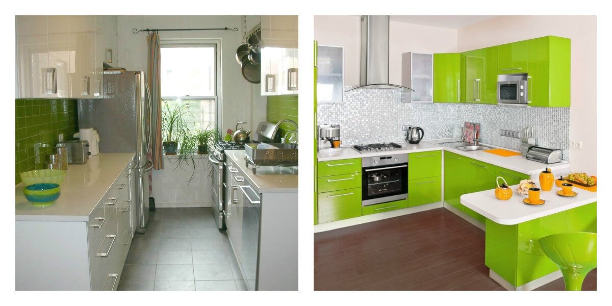
If you have a small kitchen area, it is better to choose light, pastel or bright shades of green: olive, salad, pistachio or mint. Furniture in dark shades can look too depressing and gloomy in a small kitchen.
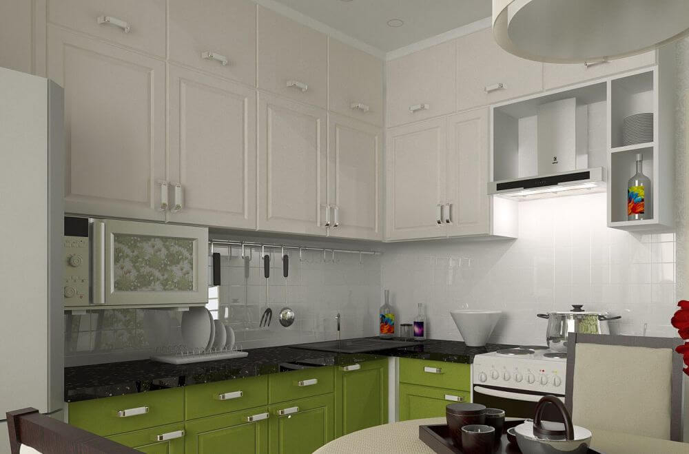
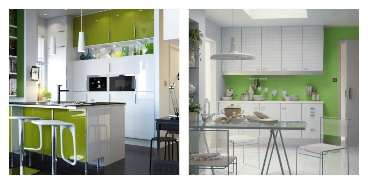
If you have opted for green furniture, then the walls should be decorated in neutral colors: white, beige, light gray, etc.
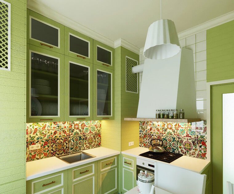
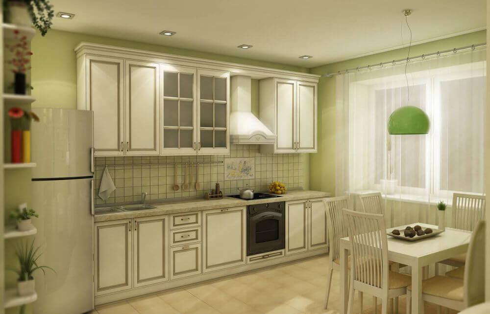
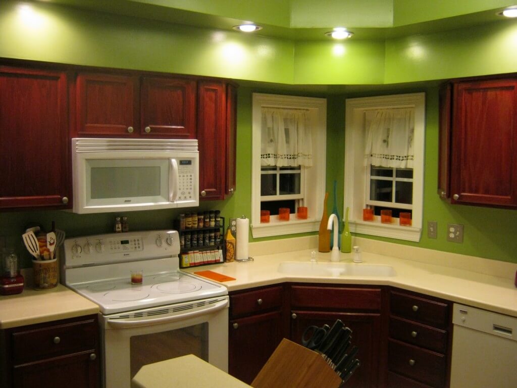
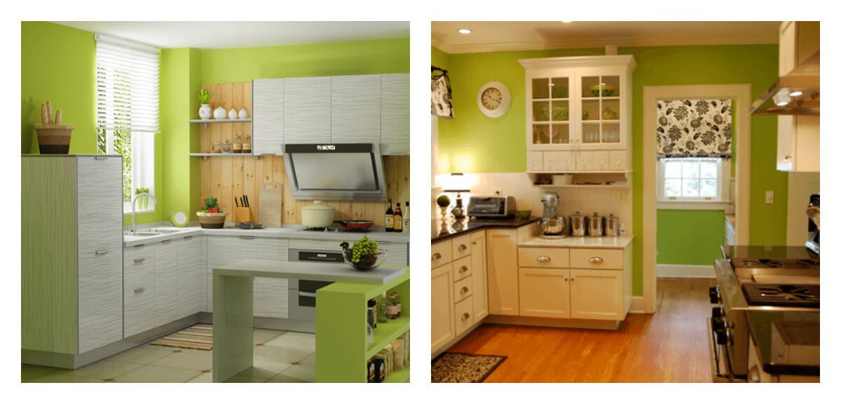
Green walls… Kitchens with green walls look beautiful and impressive.
Now there is a huge selection of various wallpapers in this color, as well as other shades, but which are perfect for a green kitchen.
In addition, you can use a special kitchen paint that washes well and is resistant to dirt. Paint manufacturers offer a huge palette of shades.
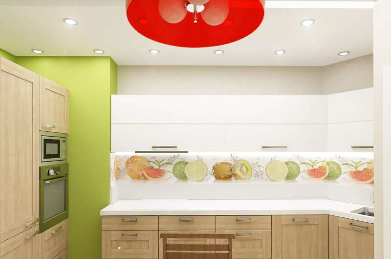
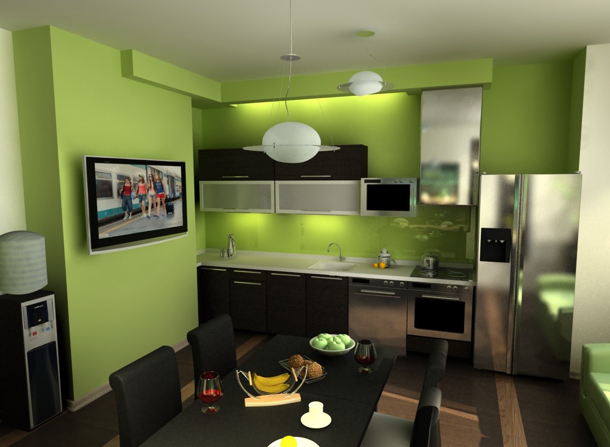
If you want to make a bright design, then you can make only one accent wall in a saturated shade.
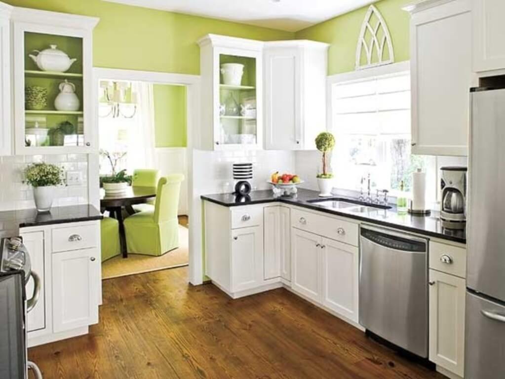
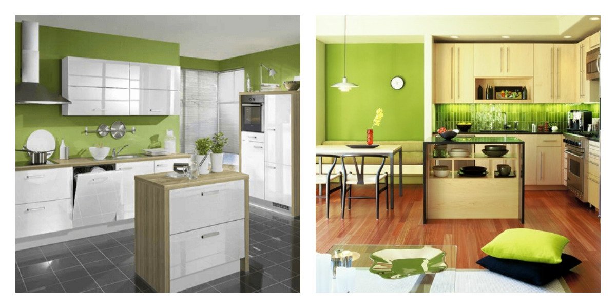
Furniture of light colors is well suited for such an interior: white, cream, ivory. A headset with a wood texture of all shades will also look harmonious.
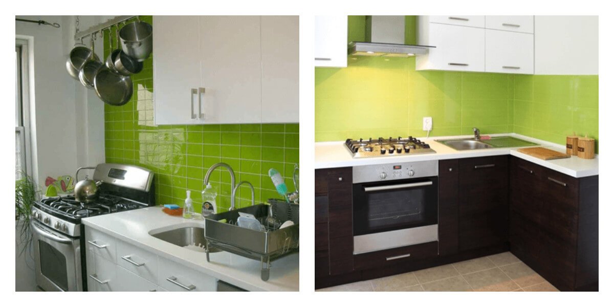
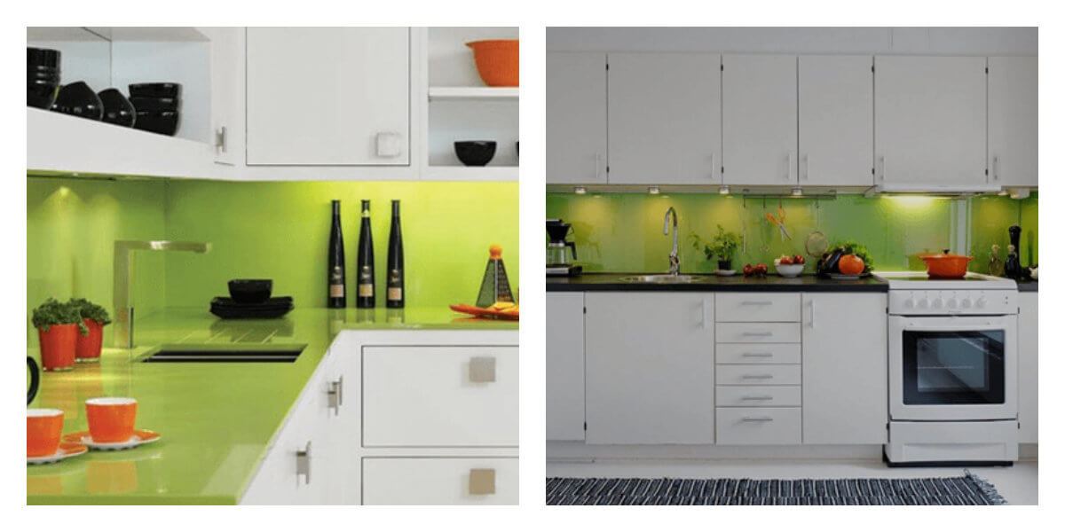
Green apron…
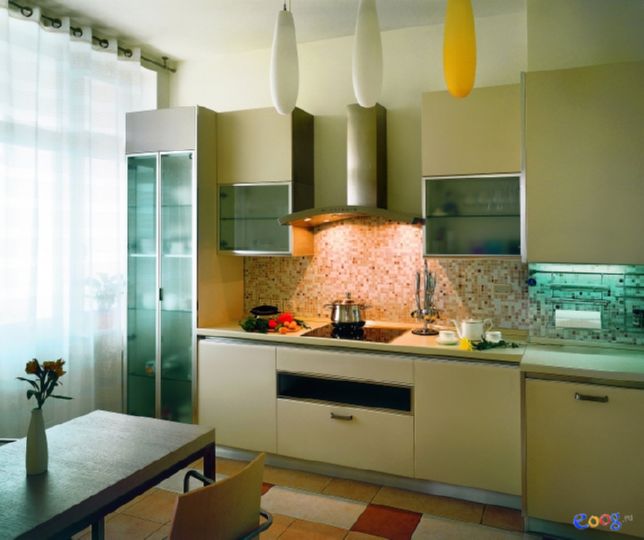
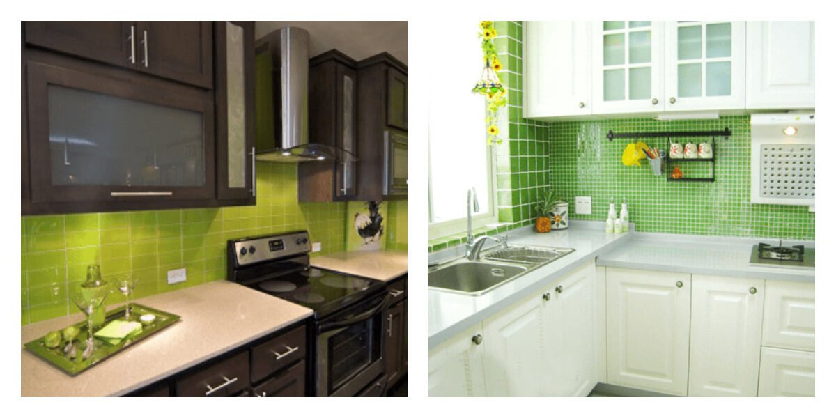
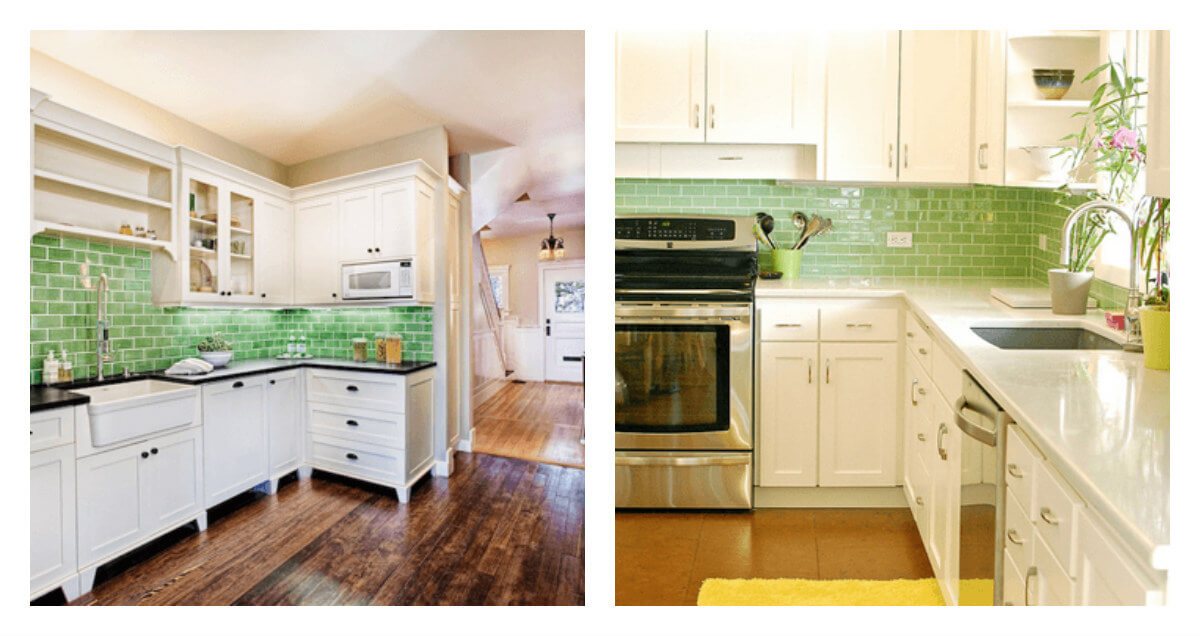
You can choose a rich shade and make a green tile backsplash as an accent in your interior design. There are many options for shades and tile layouts.
The mosaic in the kitchen working area looks interesting and unusual.
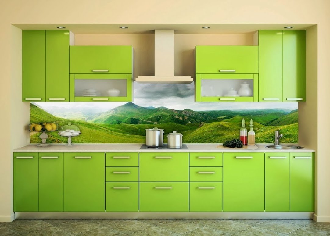
Also, a glass apron or, as it is also called, skinned, can be a good option.
Here you can give full play to your imagination: from solid colors to all kinds of images of foliage, young grass, bright fruits and flowers.
There are many beautiful landscapes in nature that will complement the interior of your kitchen.

Color spectrum
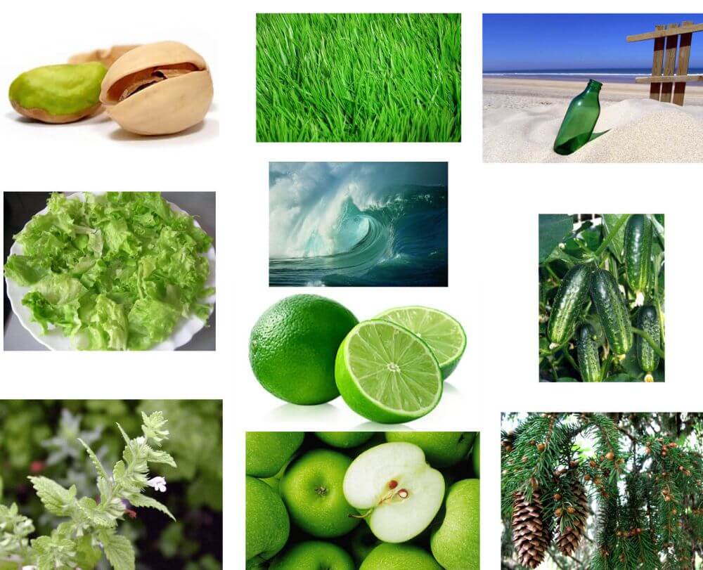
You will not believe, but it turns out there are over a hundred shades of green: emerald, pistachio, olive, light green, mint, mustard, khakki, young grass, lime, artichoke and many others.
Green is a transitional color between blue and red, the most extreme colors. It can be either warm or cold.
Like other colors, green looks different depending on the environment.
Next to yellow it seems harsh and sour. Next to orange it becomes fragrant. It blends in with blue and looks fresh when paired with blue. It looks bright on a gray background.
In the interior design of a green kitchen, combinations with the following colors are most often used:
- white;
- black;
- gray;
- blue and blue;
- red;
- brown;
- yellow;
- orange.
We offer you a selection of photos of green kitchens of various designs and colors.
White… This neutral and pure color is most often used in combination with green. You can choose absolutely any shade and it will look harmonious and fresh.
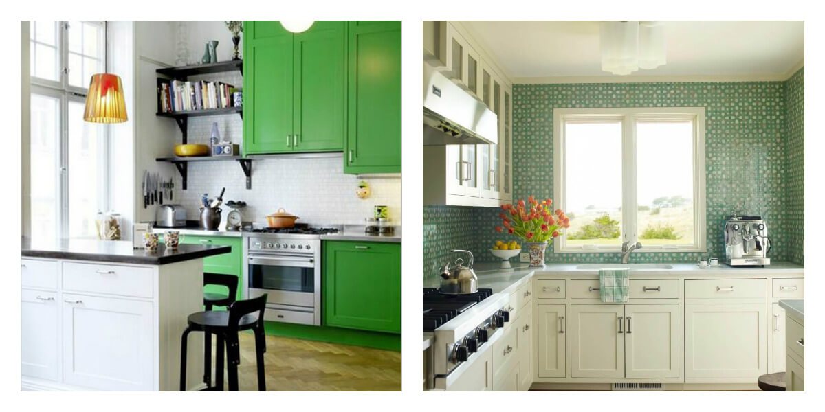
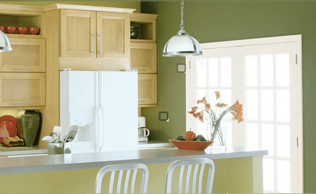
Wood… This color is in perfect harmony with all shades of wood. It looks good with light woods such as maple, ash, birch, beech. So it is with darker ones – wenge, polysander, walnut.
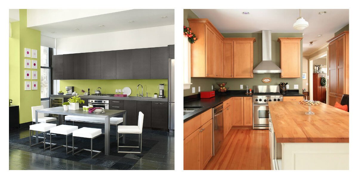
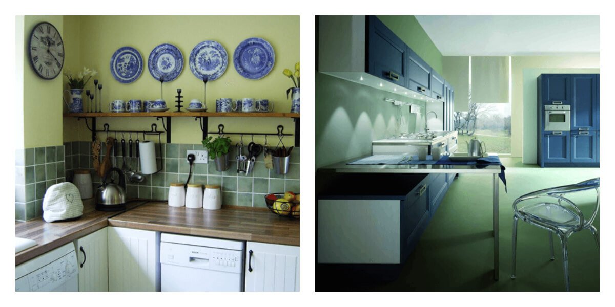
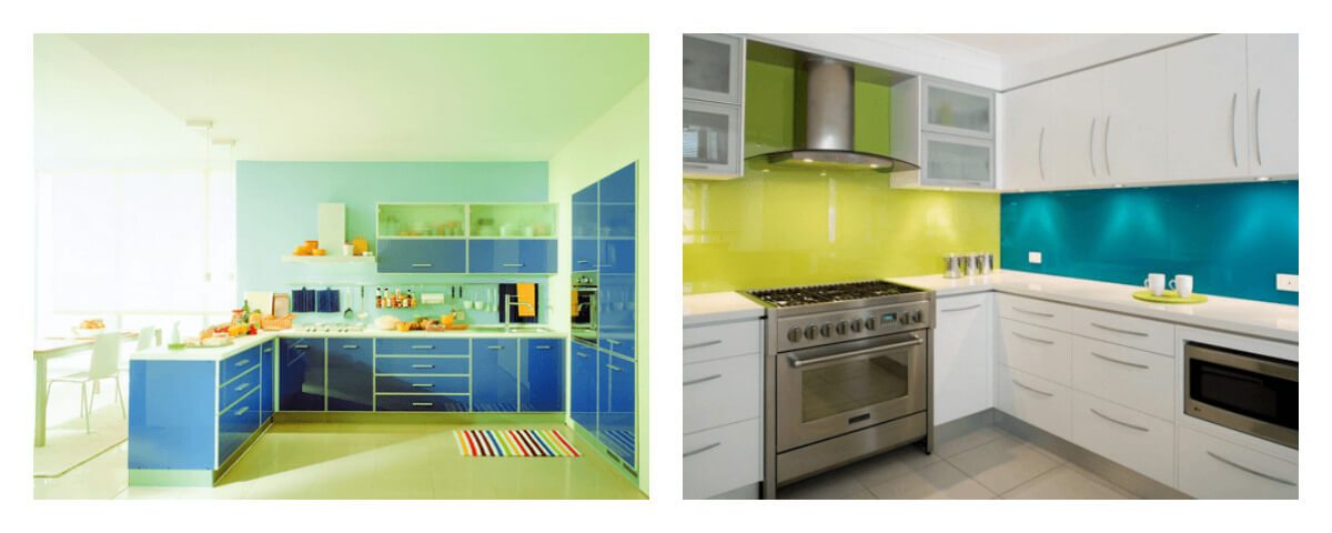
Blue and blue… Depending on the saturation of blue, it may look different when combined with green.
Dark tones create a serious and respectable atmosphere, lighter and brighter ones bring refreshing notes to the interior.
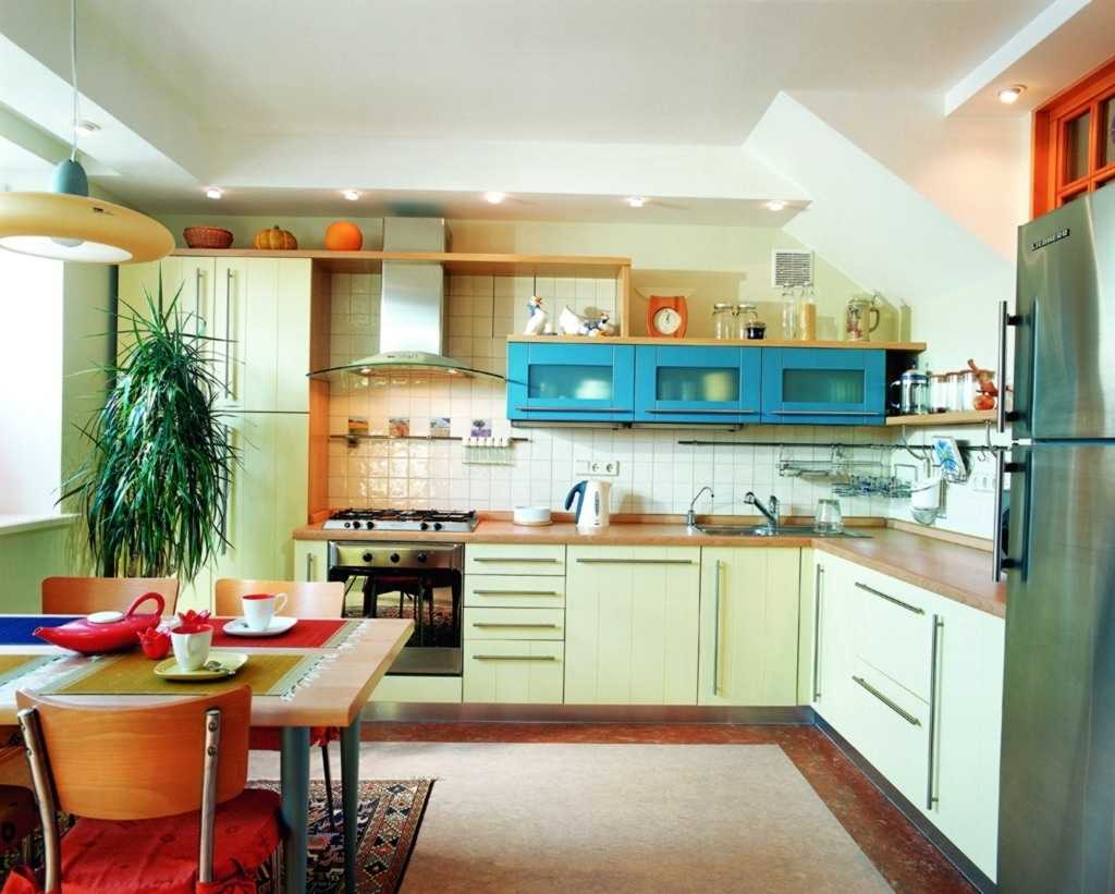
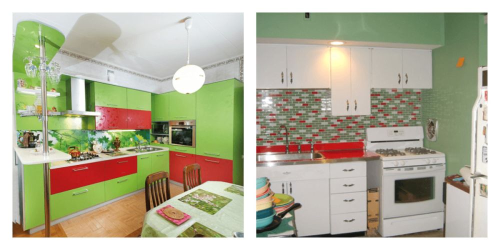
Red… This natural combination looks bright and contrasting. However, it is best to add small accents of red so as not to make the interior too colorful.
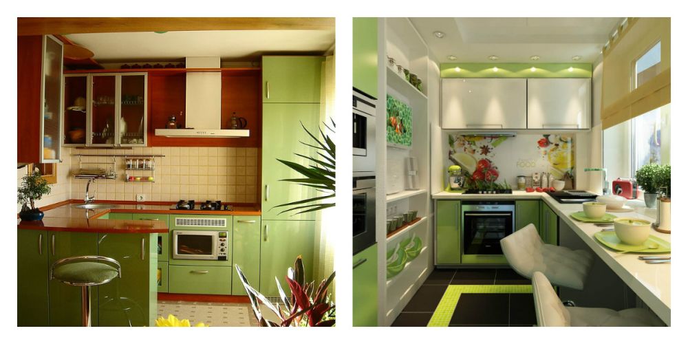
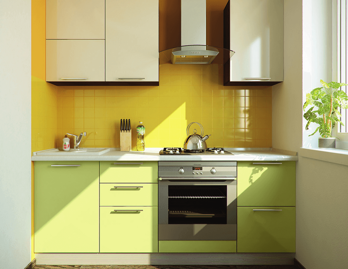
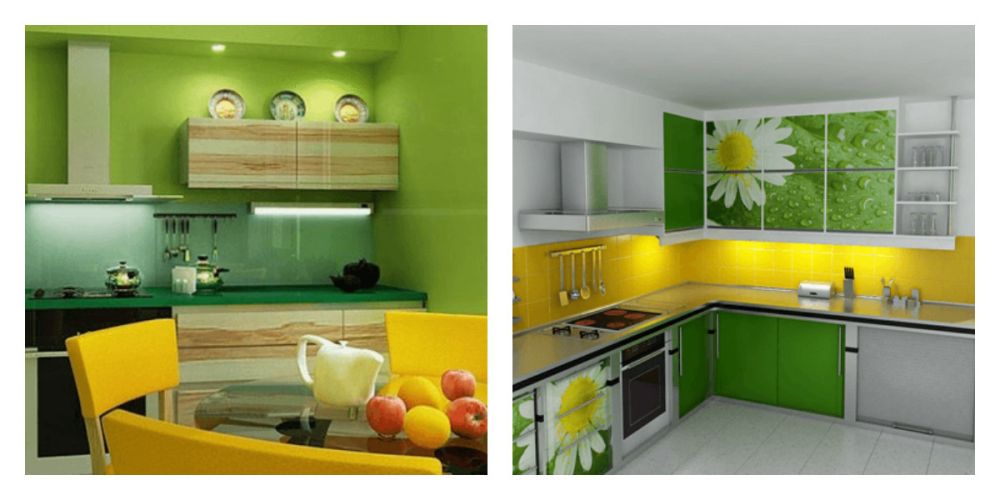
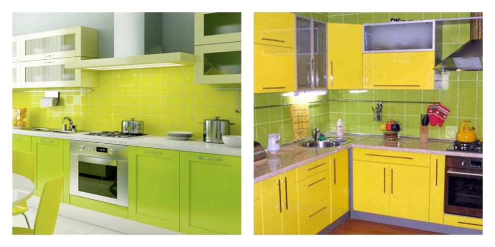
Yellow… This is the color of the bright sun and hot summer. Depending on the color saturation, this combination can be seen in various interior styles.
Bright colors are often found in modern high-tech, minimalism, avant-garde and pop art. More muted tones in this color scheme are often used in traditional Provence, country and Mediterranean styles.
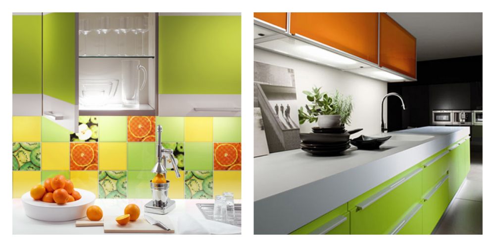
Orange… This color combination is associated with juicy oranges and tangerines. This color scheme makes the design very bright, joyful and makes it homelike.
Choose any combination of colors you like in the photo and create your own unique kitchen design!


