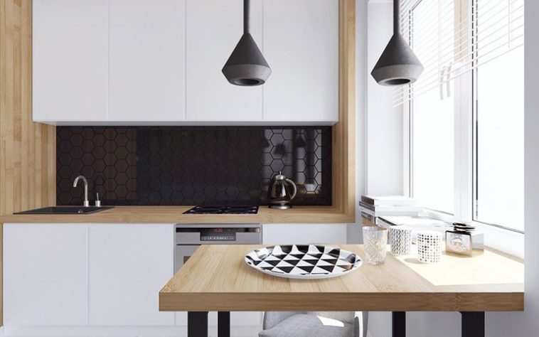
Welcome to our new post Minimalist kitchen: 99 most successful interiors
.
If you:
- like the simplicity, elegance and functionality of the apartment;
- the basic rules and characteristics of minimalism are interesting;
- renovation or renovation of the interior;
- interesting fresh ideas are needed;
then – read and see further, it will be interesting!
A little about style
As you know, every new direction in art always contradicts the old one. In addition, it gains its popularity either because it is more consistent with modernity and its realities, or vice versa – because of its contrast. And in our case, both reasons take place.

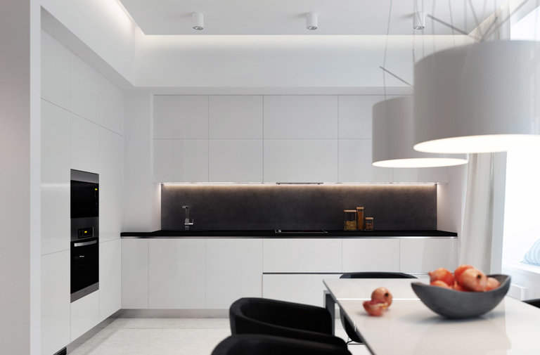
Minimalist interiors replaced abundance the beautiful but not functional decor and the overflowing, overflowing coziness that characterizes classic and rustic kitchens.
What is the reason for the popularity of minimalism, which came to us at the beginning of the last century and is gaining more and more this year?
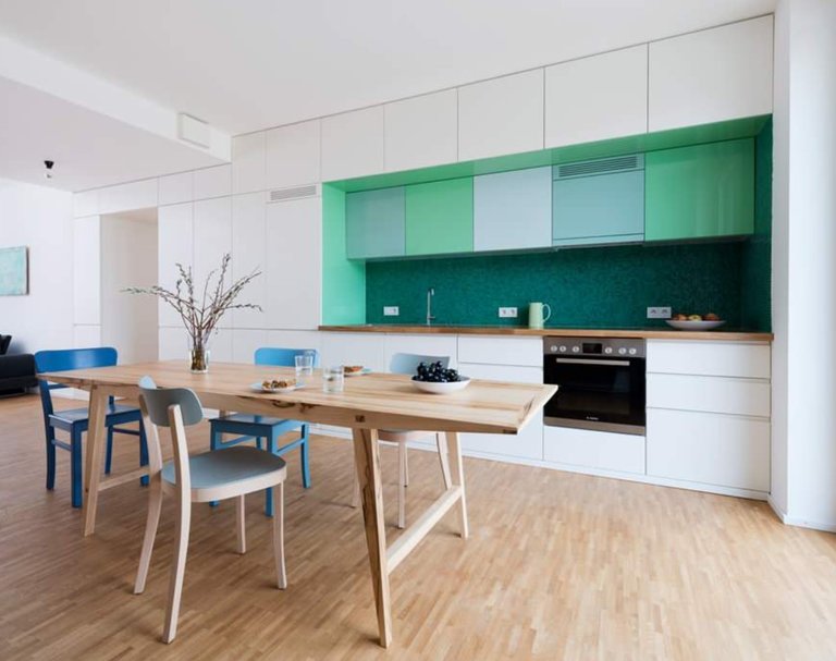
The ascetic design of our own apartment makes our overloaded brain relax and brings us to a completely different world. It turns out that minimalism is not only a product of modern life, but also a reaction to it, which is especially relevant for residents of megalopolises.
And it doesn’t matter if you are prone to perfectionism or simply do not have a weakness for bourgeois luxury and decorative elements typical of Provence-style kitchens.
Everyone wants to create an atmosphere at home that is different from work or the street, which would not burden the perception, would not press down with the blinking of colorful lights, crowdedness and variegation.
The popularization of minimalism in interior design was also promoted by the culture of the East (for example, Feng Shui), which assumes only the necessary minimum and maximum functionality of the subject content.
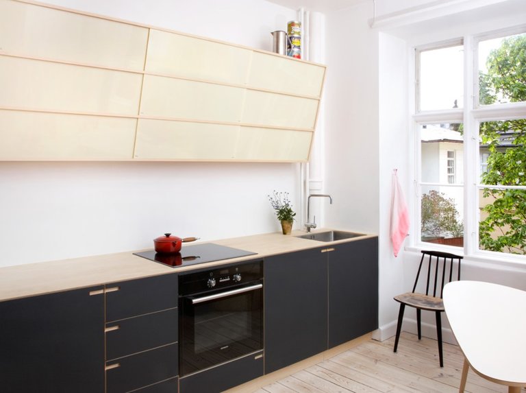
How to recognize minimalism
The main dogmas of minimalism (applicable to kitchen interiors) are:
- The kitchen contains only the necessary furniture of a simple configuration with clear lines and regular geometric shapes;
- Strict proportionality (up to symmetry) in the layout and zoning of the kitchen;
- Abundant (multi-level) artificial lighting;
- The windows are as open as possible (no curtains or translucent curtains), and the window frames are made according to the principle “minimum frame – maximum glass”;
- Maximum concealment (embedding) of everything that “burdens” the interior – batteries, pipes, wires, meters and speakers;
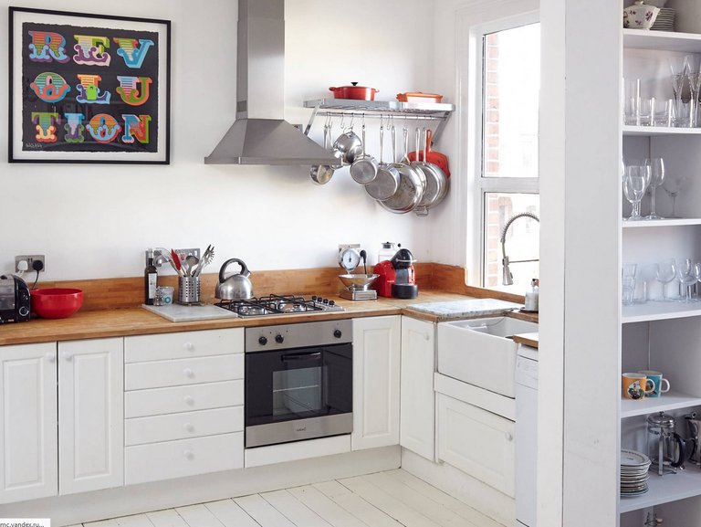
- We’ll have to give up the abundance of kitchen decor: bundles of onions, roof rails with kitchen utensils, window sills lined with ficuses, etc.
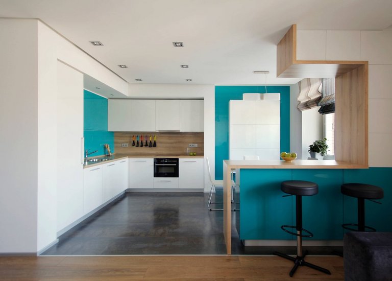
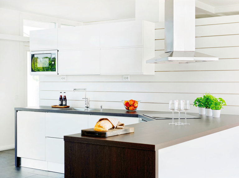
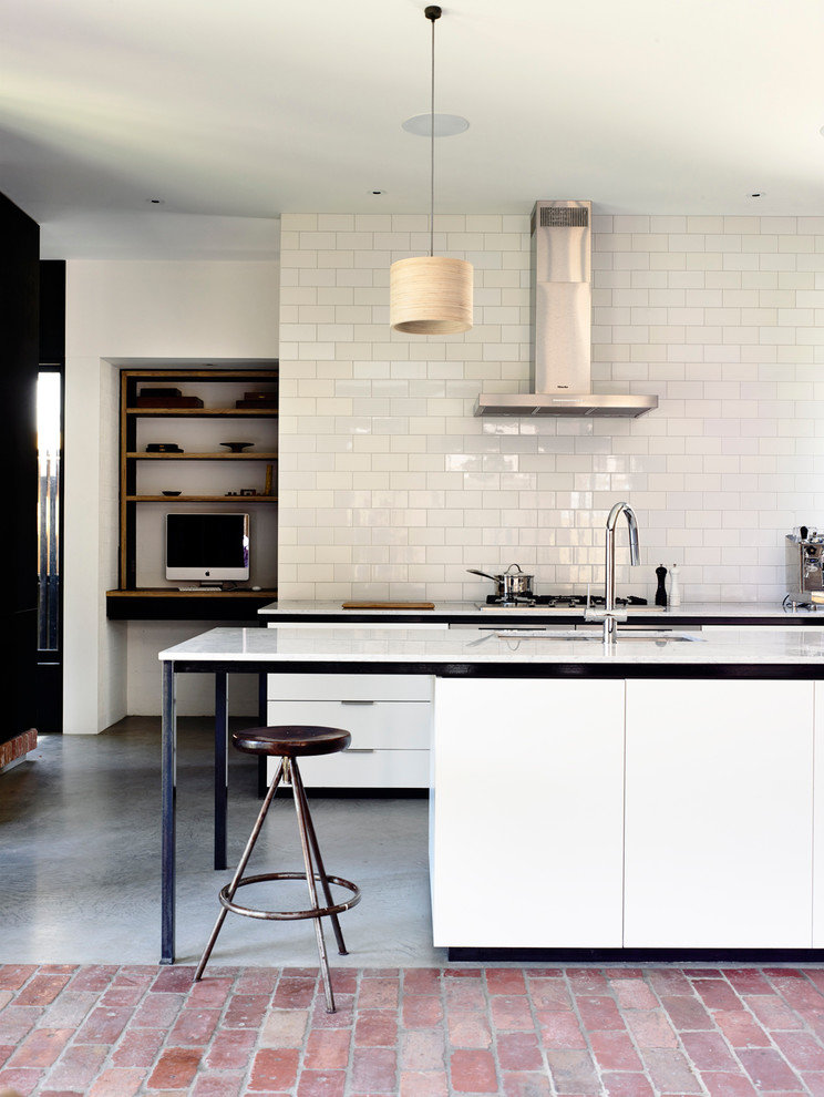
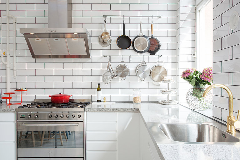
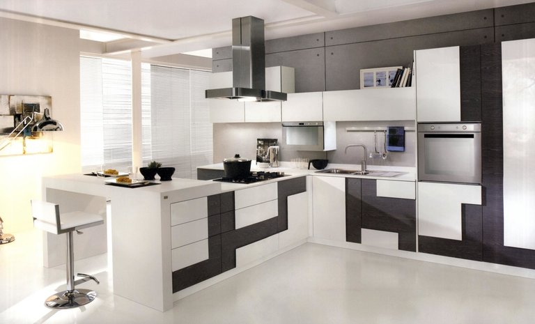
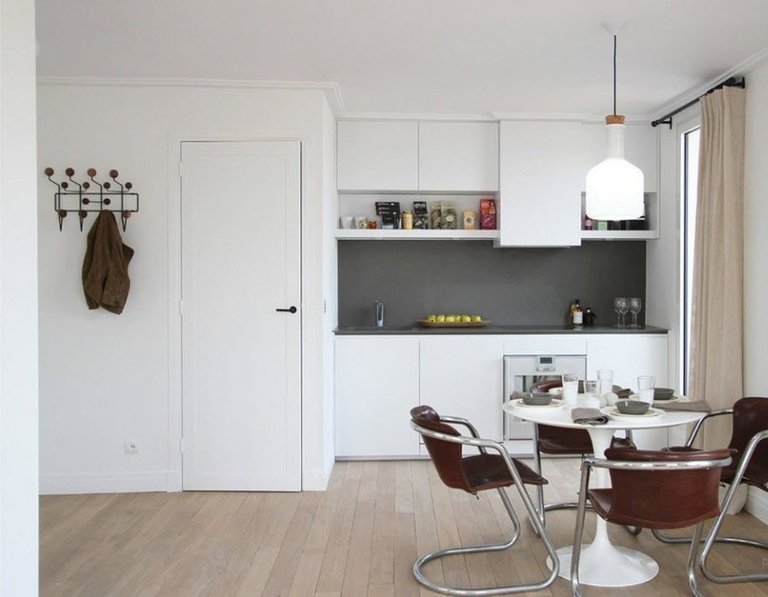
Here are a couple of pictures of minimalist kitchen designs.
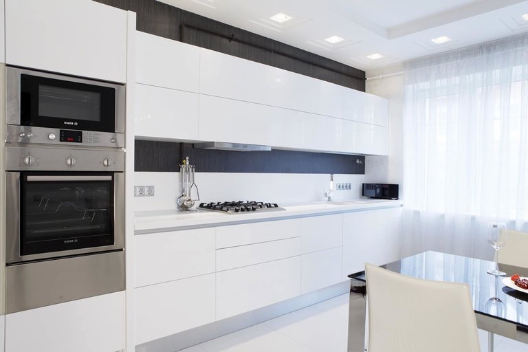
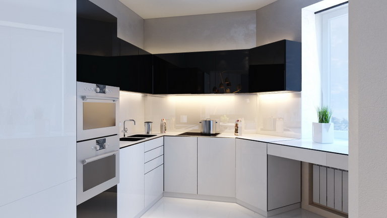
We break the rules or – permissible errors
And here are some not so critical prescriptions with refutations:
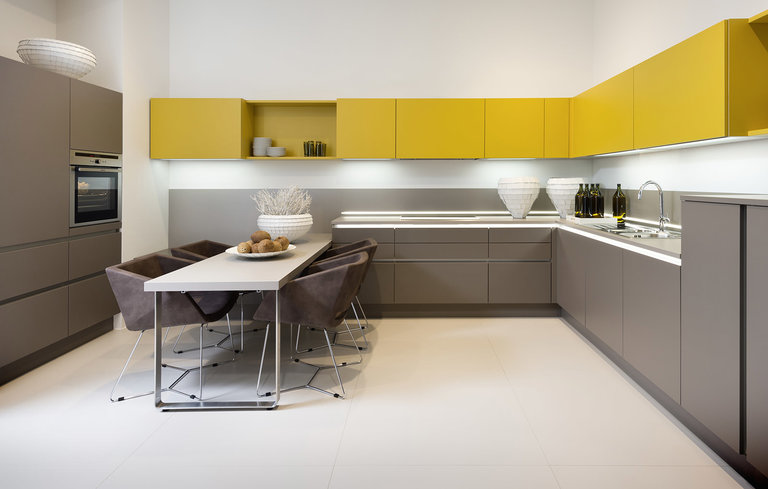
- using no more than 3 colors, mainly combinations of white, gray, black, brown or their shades. Judging by these photos, you can safely combine 4-5 colors, including saturated ones;
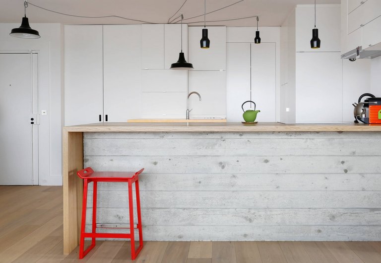
- exceptionally cold colors, diluted with “warm” wood – as you can see, this is not always the case; after all, this entire ice composition can play with the help of bright chairs, an apron or small and few decor items;
- the use of only natural materials – wood, glass, stone and metal; in view of the “biting” prices for eco-materials, their practically indistinguishable substitutes are often used;
- decorative inclined hood – it looks very beautiful, but with enhanced cooking it will definitely not cope with its main function;
- no kitchen utensils in plain sight or the most free kitchen apron – this is not always possible in tiny kitchens, and even for those who like to have everything at hand;
- multi-layered interior decoration, overlapping textures – this will be quite difficult with a limited amount of space;
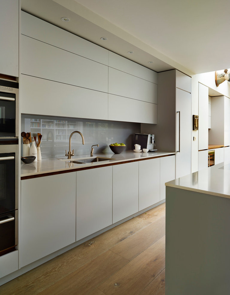
Built-in household appliances… The mini-format does not meet the needs of every family, which makes such a technique less functional and, accordingly, contrary to the basic principle of this direction. If necessary, a refrigerator of standard sizes can be built into a large pencil case without violating the integrity and color scheme of the composition;
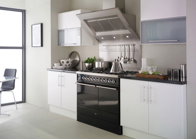
Lack of handles on furniture fronts… Firstly, railing handles are acceptable, and secondly, push-ups and other newest mechanisms may turn out to be not only unusual, but also inconvenient, which, again, is not very functional.
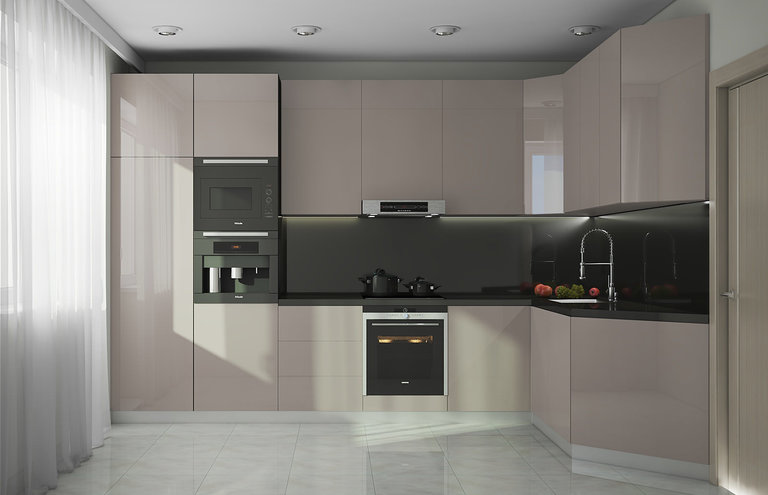
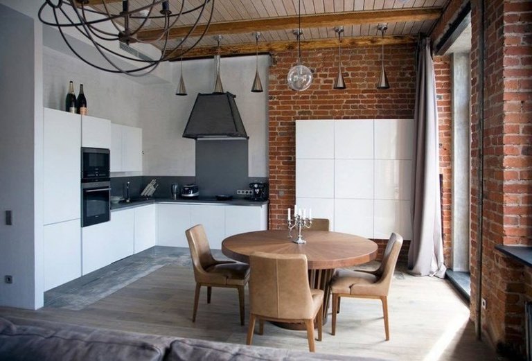
Minimalism is friends with other modern trends. Hi-tech can be safely called one of its incarnations. Minimalistic furniture looks great against the loft-style brick walls.
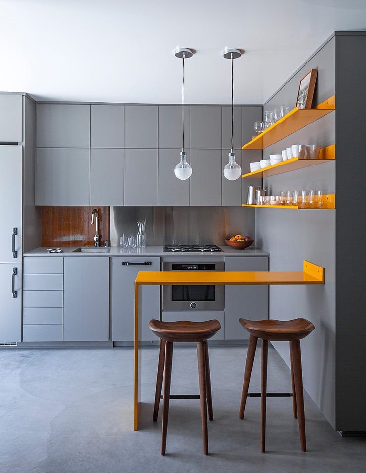
The violated, but quite often still used rule of 3 colors was borrowed by minimalist designers from interiors decorated in a classic style. But this strict style, you see, is very different from colorful fusion and soulful country.
Maximizing space
The fewer items and décor there are in the kitchen, the larger it seems, doesn’t it? Therefore, a small kitchen in this style is a very good solution that will visually increase the volume of any room. To create additional space will help you:
- the predominance of white and its various shades;
- the color of the floor is the same color as the set;
- the same color of walls and ceilings;
- gloss, glass, polished marble or other reflective materials;
- no bulky chandeliers and curtains;
- a sliding partition instead of a door;
- good and uniform lighting (for example, LED lighting – it can be installed both along the perimeter of the ceiling and at the junction between the wall and the hinged kitchen unit).
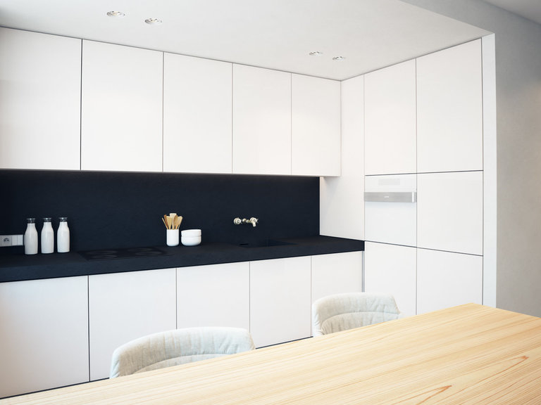
If you are lucky with a window or bay window, make them a natural extension of the kitchen. An additional work surface can be located near the window or a good replacement for the usual table can be built in – a bar counter.
Why not, if there are only two of you in the house? And it is more pleasant to eat, enjoying the beautiful view.
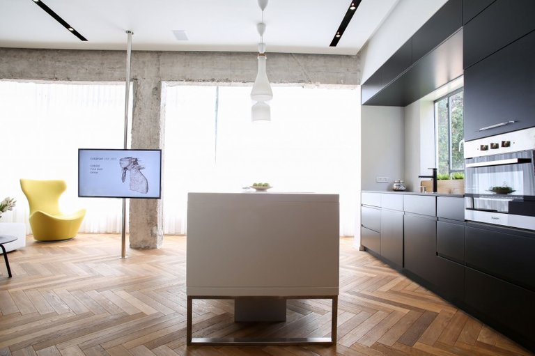
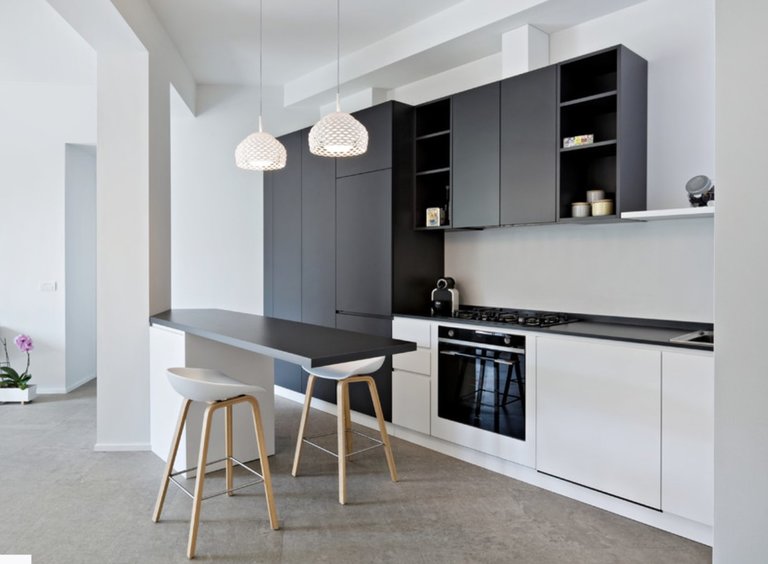
In the kitchen-studio, the bar counter will separate two different functional areas – the dining room and the living room. Peninsula kitchen layout is also a good way to separate, suitable for medium sized kitchens.
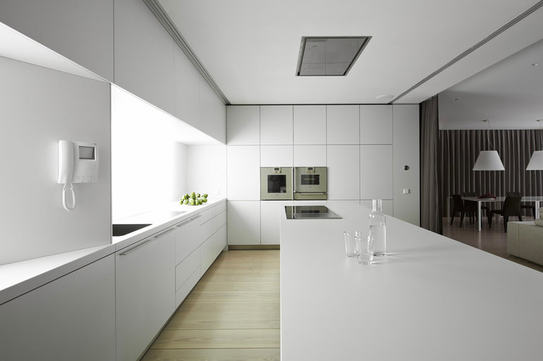
Furniture
When doing a kitchen design project, do not forget: a minimum of furniture, and it should be as practical as possible, lightweight, with even silhouettes.
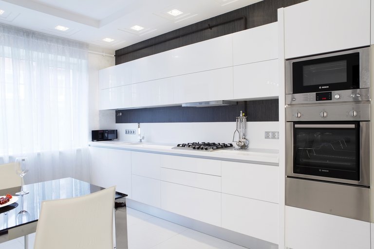
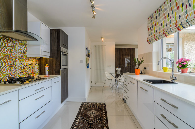
The feeling of lightness will create translucent invisible chairs or the most common stools, characterized by simplicity and subtle lines. Folding chairs can always be taken out of a closet or pencil case, thereby increasing the number of seats.
Table top can be made of artificial or natural stone or solid wood. The extendable transforming table is very convenient in small spaces. Use it for your daily routine and for guests.
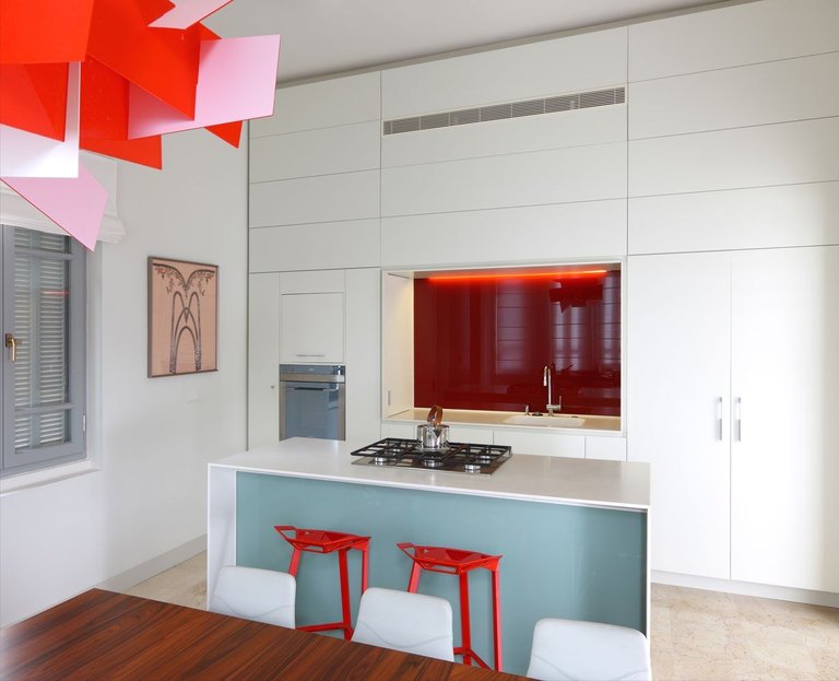
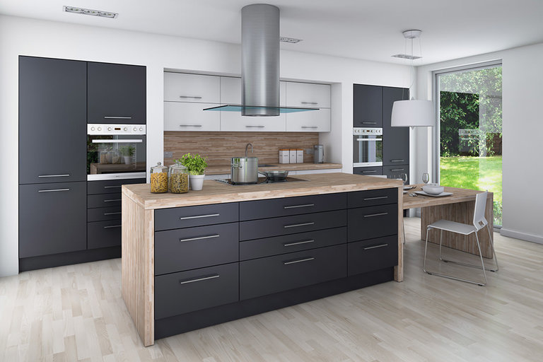
In a private house, you can safely apply the kitchen layout “with an island”, which will allow the most ergonomic distribution of the kitchen space. This will ensure both the passage between the modules and free access to the required surfaces.
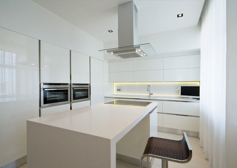
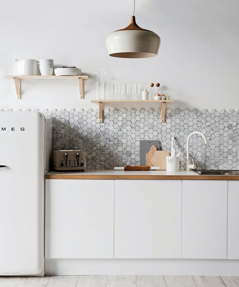
It is the island, which consists of several components – a sink or a hob that can easily open and close, transforming into a spacious dining table.
The same layout is possible in a private house, where it is possible to bring the necessary communications to the modules located in the center of the kitchen. The hood, as you can see, can also be in the form of a dome – so the kitchen smells will definitely not leak into the living room or other rooms.
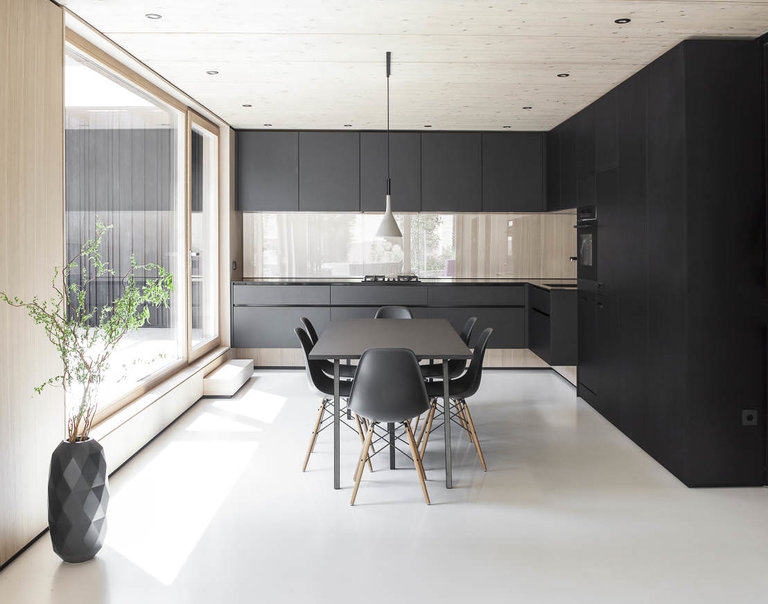
It is better to replace wall cabinets with niches. – of course, if space permits. When you can’t do without them, decorate them in white – it will make the interior less cumbersome. However, you can achieve this by embedding the LED strip underneath the wall mount, just above the work surface.
Lighting
In addition to the ubiquitous LEDs, minimalist interiors use neon or halogen lamps, LED panels, spots, busbar and pendant lamps in the correct round, oval, rectangular or square shapes.
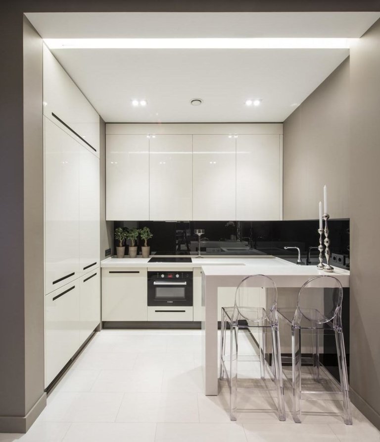
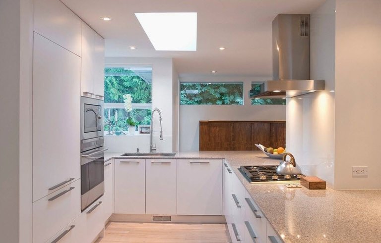
With diffused lighting, i.e. in the absence of a single source of light, it seems that objects merge with the environment. Lighting will do a great job of zoning your studio kitchen.
Install a chandelier in the living room, for example, made of steel, and in the kitchen – spotlights and LED backlighting. Remember – one decorative element per 9 square meters. But it could be a chandelier!
Color spectrum
White is the king of minimalistic interiors. But, you see, an exceptionally white kitchen looks a little boring, although it seems larger.
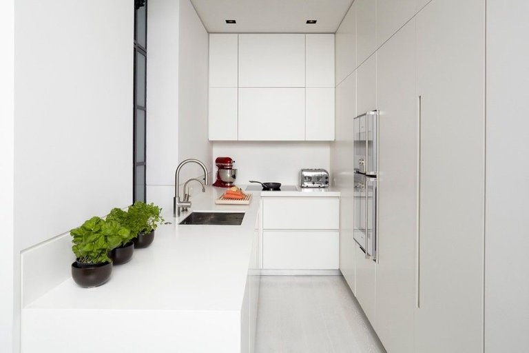
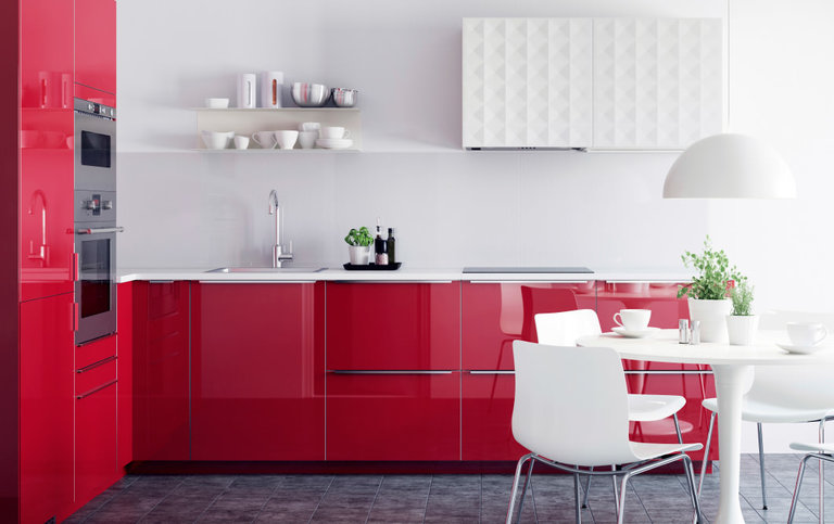
I would like to note that black glossy or polished surfaces have the same effect… Most often, minimalism involves restraint in color.
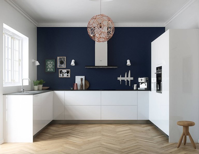
In addition to monochrome design or combinations of classic white, black, gray and brown, more emotional colors will organically fit into such an interior. At the same time, the walls and ceiling usually have the same light color, and let the kitchen apron shine with brightness, the furniture – the set or its individual parts, chairs or household appliances.
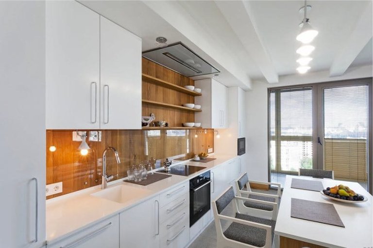
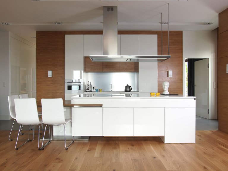
However, both a chandelier and a designer vase can be a striking element. Just do not forget, overkill with brightness, as well as with decor, is not allowed – saturated color must certainly be in the minority.
A kitchen apron, like one “free” wall, can have a small and discreet pattern or small ornament. But in this case, the floor must be made monochromatic. Its colors are traditionally either much lighter or much darker than the general color scheme.
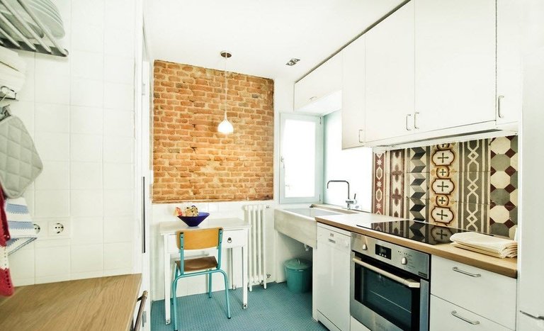
If you find it difficult to find the best match for your chosen dominant color – give preference to wood. It goes well with any color, has many different shades and will really add comfort and warmth to your kitchen.
Here are examples of traditional (and not so) minimalist interiors:
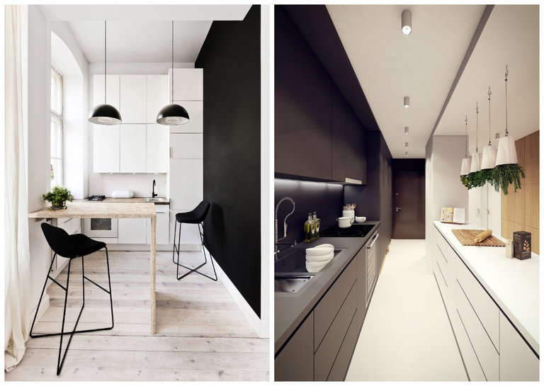
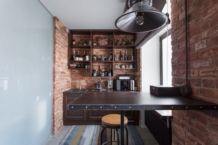

Final tips
And in conclusion – simple tips for fans of minimalism who do not intend to renovate or update the interior. Here’s how you can easily bring your kitchen closer to this style:
- get rid of everything unnecessary in the kitchen – devices intended for seasonal cooking (pickling jars, baking dishes, a juicer) or everything that you rarely use can be placed on the upper shelves or even transferred to the pantry (to the balcony);
- Get rid of things that serve the same function – do you really use all the sets of pots and pans?
- purchase multifunctional equipment;
- keep only what you need for the day on hand;
- you are at home, not in a restaurant, and it is not at all necessary to have special glasses for each type of drink;
- besides giving up unnecessary things, it is also important not to buy anything new.

By the way, you can find out even more useful information about organizing order in the kitchen in this review.
Well, now you know how to characterize a minimalist kitchen interior and how easy it is to achieve this in your apartment. We wish you to find the perfect composition of beauty and functionality!

