Welcome to our new post How to choose the color of the kitchen – Tips and design tips
.
Hello! So, in this article we will talk about the following:
1 Designers’ chips
2 Choosing a color from the side of the world
3 Tips for choosing a kitchen color:
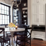
This article is a list of tips, not a photo gallery. If you are looking for a large selection of photos of kitchen interiors, then you need to go here.
Design techniques for choosing the color of the kitchen
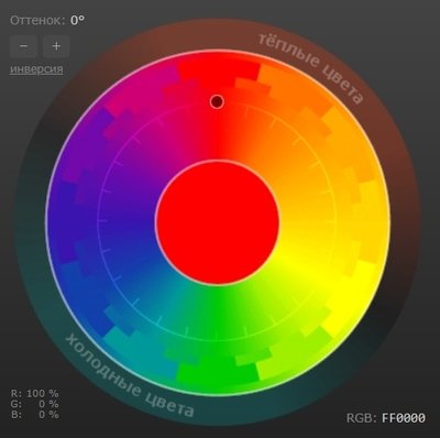
Color circle – a tool for designers who select colors and shades for the room, including the kitchen. With the help of this tool, the scale is built to create a harmonious interior. The circle can look differently, but one of the most successful options is the one in which the base colors are the basis: red, blue, yellow. Already on their basis, additional colors are built.
Another color wheel is built on the basis of saturation or brightness: the further from the center, the more saturated the hue.
Wherein black, white and gray do not participate in the color wheel: they are monochromatic and match the whole range.
Principles for selecting kitchen shades using the color wheel:
- 1 Monochrome beam – shades are selected within one ray, which is from the center of the circle to its edge. Monochrome selection allows you to get the layout of shades of the same color. It is not necessary to do this manually: you can use a specialized application.
- 2 Complementary contrast – two rays are in a circle opposite each other. This principle gives a very effective scale, but it must be applied carefully. Otherwise, it’s easy to go into too bright colors and get a gaudy, flat-looking interior. It is wiser to use halftones and add textures, such as wood.
- 3 Analog principle – probably one of the most harmonious, because it occurs most often in nature. Three rays are directed from the center of the circle, and their ends are located at an equal distance from each other, so that the combinations become much larger.
- 4 Triad – a scheme in which three beams are equidistant from each other and form an equilateral triangle. The center of the triangle is the center of the color wheel.
- five Tetrad – arranged by analogy with the triad rays, which form a square or rectangle. However, this principle is used less often, since there is a risk of creating an atmosphere overloaded with flowers, and comfort and tranquility should reign in the kitchen.


You can play with the color wheel online through the colorscheme.ru service.
The key rule in the interior is called “60-30-10”… This means that 60% should be in the primary color, 30% in the secondary, and another 10% in the accent colors. It is not just about the colors as such, but about the rays in the color wheel, that is, about the shades of one tone.
The dominant color takes up the most area. The secondary can, for example, be used for an apron. Accents can be set by ordering a headset and other elements.
Read also: Rules for combining colors in the interior of the kitchen (there, in the comments, you can ask a question to the designer).
Choosing the color of the kitchen and the cardinal points
If the kitchen is located on sunny side, shades are perceived brighter. With sufficient illumination, suitable:
- saturated blue – thanks to the light, the space will not visually decrease;
- muted tones that do not look too bright under the rays;
- cold shades to keep the atmosphere fresh, not “hot”;
- natural shades that give rest to the eyes;
- graceful, aesthetic gray tones.
On north sideon the contrary, it is not enough. Therefore, you need to use light colors:
- pastel colors – it is better to avoid pure white: sometimes it looks uncomfortable;
- light colors, if possible without dark elements – for furniture and decoration;
- wood shades, carpet, carpet – for the floor.
Feng Shui is a separate practice for choosing colors with its own recommendations:
- warm, light shades (light green, cream, beige, white) improve appetite, increase psychological comfort;
- no need to go over fiery shades (pink, orange, red), as well as water, cool.
According to the philosophy of feng shui, the elements of fire and water reign in the kitchen, therefore the shades corresponding to them should be in harmony, in balance.
Choosing a floor color
Rules for the selection of tiles for the kitchen:
- white or black gloss creates a conservative style;
- silvery, golden shades harmoniously complement black;
- mosaic tiles go well with white furniture, black with red;
- bright tiles add volume to the kitchen, gray ones create a cool feeling.
Recommendations for the selection of linoleum:
- warm pastel colors create comfort;
- wood colors are combined with the carpet;
- dark linoleum is suitable for light furniture;
- ginger coating should be in harmony with other decor;
- if the walls are light, linoleum, on the contrary, should be saturated.
Tips for choosing a laminate:
- classic – wood grain in natural shades;
- dark colors are successfully combined with furniture and light-colored walls;
- the surface, decorated with a stone, is suitable for high-tech and minimalist styles.
An important role is played by the texture of the material, which should be combined with the texture or with a monochromatic solution.
Choice of ceiling color
Main article: Ceiling design in the kitchen
It is unlikely that this will be a discovery for you, but the overwhelming majority make a white ceiling. Painting, tension or plasterboard, from panels or whitewash – it’s as you like. But the fact remains – the white ceiling is the most versatile option.
If you want something different, here are some tips. When choosing a ceiling, take into account the shade of the furniture, the size of the room, the level of illumination. So, a dull or dark ceiling is not suitable for a small kitchen. Light pendant coating (beige, turquoise, golden, lilac, gray), on the contrary, visually expands the space.
If the coverage is multi-level, then you can select a separate color for each level. One of them must necessarily be light – the shades must not be allowed to be too dark or too variegated.
Choosing the color of the countertop
Main article: How to choose the color of the countertop (by the way, our designer constantly comments on it)
You need to choose the right countertop. In order not to depend on her later, it is better not to use a catchy thing. If this interior detail turned out to be bright, this is taken into account when decorating, choosing the rest of the range.
The stone countertop looks elegant, but you need to duplicate the same material in some other place in the kitchen. Otherwise, this element will look foreign. You can decorate the floor, window sill or part of the wall with stone. It is best not to order the apron in exactly the same tone as the table top.
A wooden tabletop is an excellent solution when a dining table, chairs, windows, shelves are made of wood. But so that the kitchen does not resemble a bath, the rest of the furniture should already be made of painted wood or, in general, from another material. Wood combined with white walls is used in Provence style interiors.
Choosing the color of the kitchen apron
Main article: How to choose the color of a kitchen apron
The final impression depends on a well-chosen apron. If it is bright, then you should not order a colorful wall covering, furniture. Either a bright apron, or a colorful kitchen – this is a rule that must be followed.
Mirrors and contrasting shades are successfully combined with red, white and woody shades with blue. Yellow and green tones look good together, other natural shades (brown, woody, gray) are successfully added to them.
The recommendations are also valid for natural materials. For example, the floor and furniture in the color of marble veins are in harmony with a marble apron. Granite apron can be duplicated in other places of the kitchen within 10% of the total area.
If the apron is decorated with an ornament, then this decor should be used somewhere else: in a chandelier, tiles or curtains. At the same time, it is better to make furniture and walls neutral in order to avoid variegation.
Headset color selection
The color of the headset is in many ways defining. Having chosen it correctly, you can correctly place accents, complement and complete the look of the kitchen, made up thanks to the rest of the interior elements. The colors themselves can be versatile, warm or cold, moderately saturated, brightly saturated.
Universal colors
Several colors are generally accepted as universal. Each of them is used in many styles and has a number of properties:
- White considered suitable for a small kitchen, and most often they use several shades of white in combination with flowers of crème brulee, champagne, baked milk. White is also paired with metallic accents.
- Grey great as a discreet background that emphasizes the whiteness of the facade. Cool gray pairs well with warm beige.
- The black is increasingly used in the form of shades such as anthracite or graphite rather than bluish black. For combinations with white, matte facades are gaining popularity, although glossy ones were also in vogue.
Warm, moderately saturated
These are shades that create a sunny, light environment. The most popular ones are:
- beige,
- woody,
- cappuccino,
- sand,
- Ivory.
Cold, moderately saturated
Cool shades are used to create a feeling of freshness, calmness. These include:
- blue,
- olive,
- purple,
- pistachio,
- champagne.
Saturated
If you use bright colors in moderation, then you can create an original range without unnecessary tweaks. These include:
- eggplant,
- turquoise,
- yellow,
- green,
- red,
- lime,
- Orange,
- blue,
- Violet,
- fuchsia.
The verified range makes the kitchen aesthetically pleasing, creates a mood of calmness, comfort and tranquility among those present. If you adhere to the listed rules, then you can, without slipping into variegation and tastelessness, create an original, memorable interior based on your own ideas.
If you have any questions – write in the comments!
I also recommend looking at these articles: