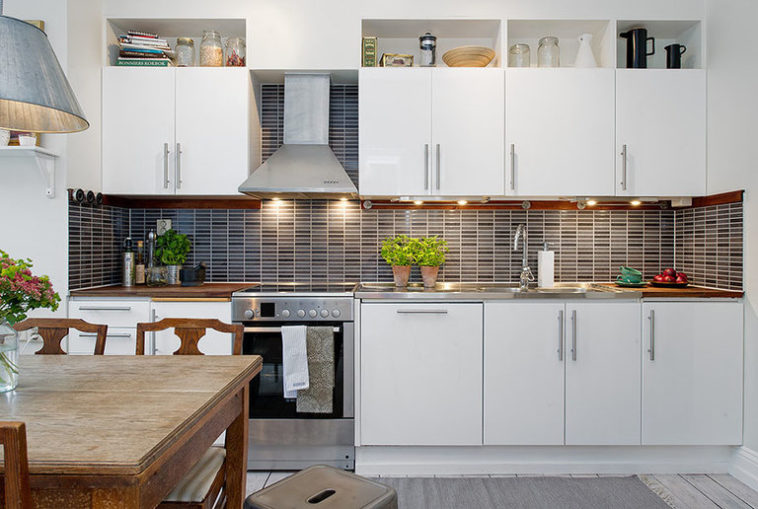
Welcome to our recent post design and 99 photos of kitchen interiors in white
.
Some designers noticed that the farther south a country is, the brighter it is customary to decorate furniture sets and rooms there.
This is especially evident in the traditions of decorating kitchen facilities in the south of France, Italy, Spain, and Greece.
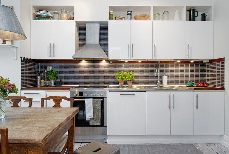
There are many options in the palette of light colors, but white can be found very often in the interior.
Let’s take a look at a few general rules that apply if you want a kitchen like this.
A little about styles
Versatility is one of the most significant advantages of this color. It can be effectively integrated into any interior style. We will just give some of the most relevant examples:
- Classic. A light set, consisting of wall cabinets with hinged doors, a sideboard and a pencil case in combination with natural wood, will create an atmosphere of home warmth, comfort and respectability of the owners.
- Scandinavian. The whole palette of shades will fit here, ranging from snow-white to creamy tones. It is better to select furniture made of wood, painted with matte paint. A wooden floor with its original natural texture will help to emphasize the design.
- Modern. To give the room a modern, futuristic look, give preference to materials such as acrylic, plastic, varnish. Glossy tiles, laminate, linoleum are suitable for arranging the floor. The final touch to the design will be supplied by built-in appliances and multi-level lighting.
- Provence. Romanticism and unique flavor of a cozy French village will help to convey muted shades of objects and wall decorations, living vegetation and floral patterns, ceramic dishes and decor.
- Country. This style combines comfort and simplicity. Open shelves, painted pottery, and an abundance of decorative rustic items will fit into it.
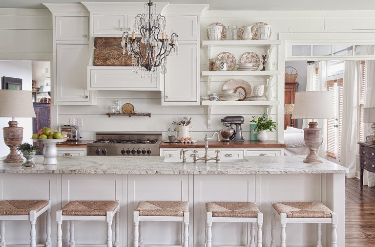
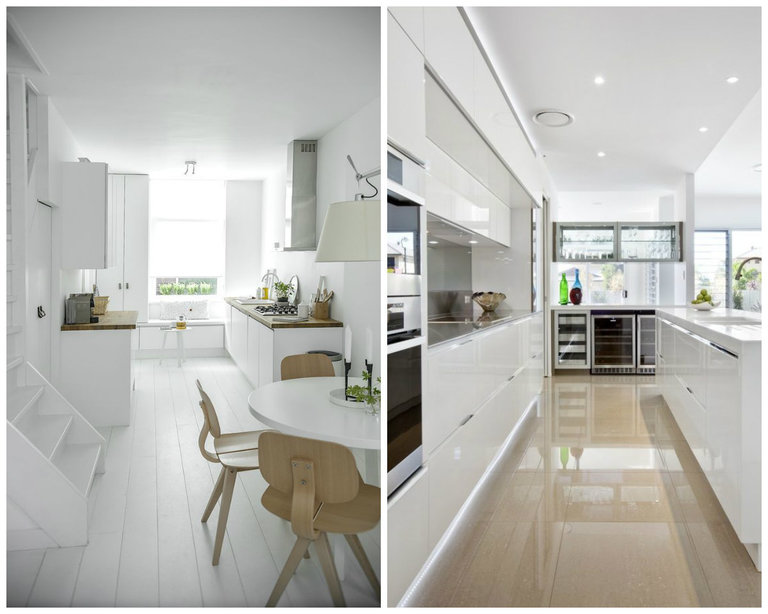
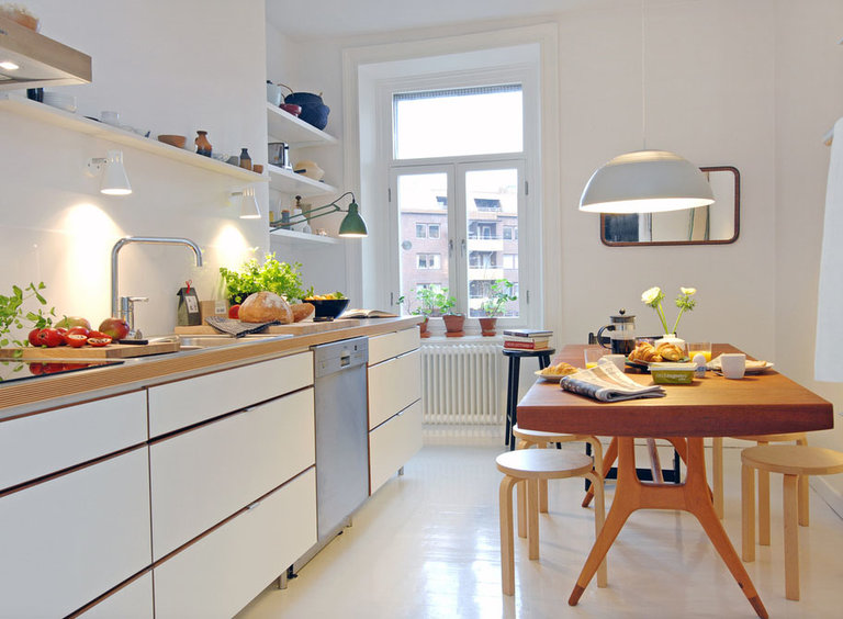
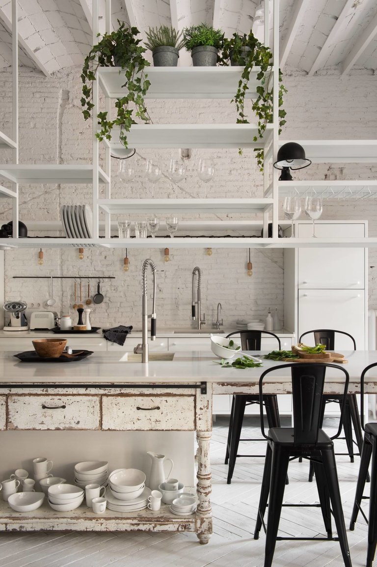
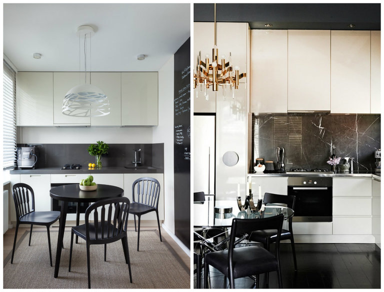
As you can see in the above photos, the white kitchen will look stylish, effective and appropriate in any interior.
Glossy headset
As unnatural as it may sound, glossy furniture has won consumer acceptance due to its practicality. It is easier to care for than colored counterparts.
The main problem with gloss – fingerprints, water drips. On a light background, they will be almost invisible. The contamination will, of course, be conspicuous, so you will be able to remove it quickly, avoiding serious accumulation.
Objects are remarkably reflected in shiny facades, especially under the influence of artificial lighting, which contributes to the visual expansion of the surrounding space. Here, for example, are some real photos of such interiors.
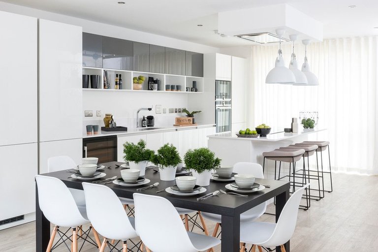
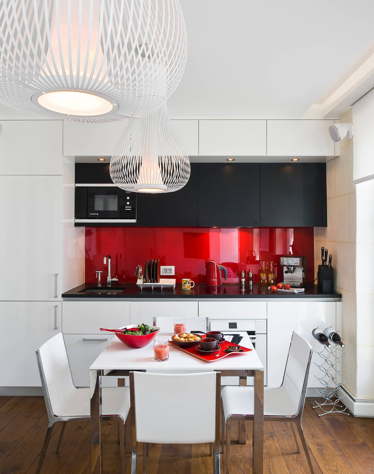
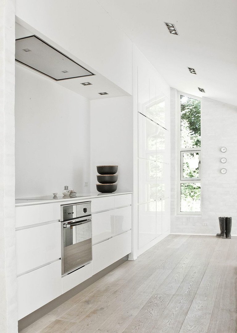
Such headsets look extremely stylish, effective and fit perfectly into modern interiors.
Small white kitchen
For a small room, this color will be a real find, since it gives a small-sized space additional volume, gives a feeling of freedom, airiness and purity.
Light shades can be present in the decoration of walls, ceilings and floors, as well as furniture.
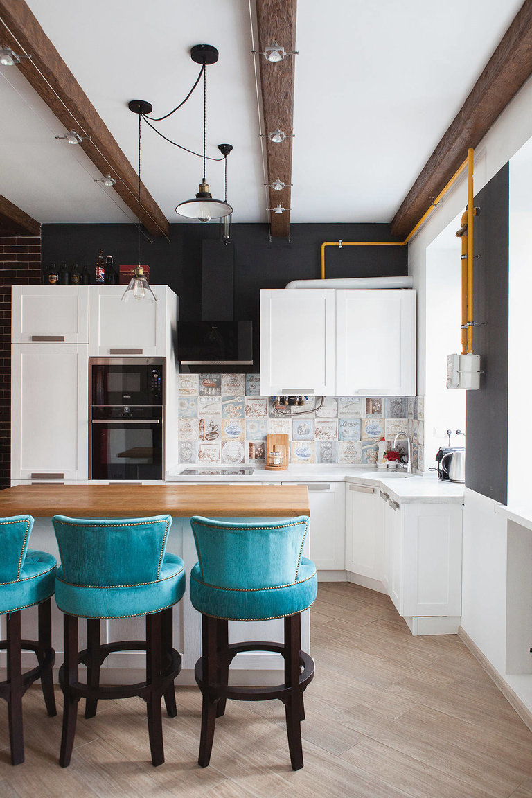
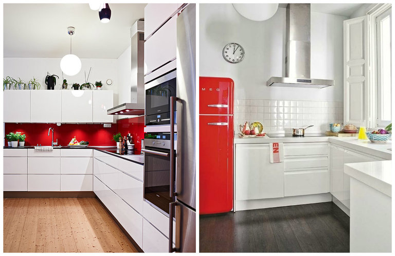
So that the created picture is not overly monotonous, it is necessary to slightly diversify it. A dark floor or countertop, shiny household appliances and pendant lamps, decorative elements can act as an accent addition.
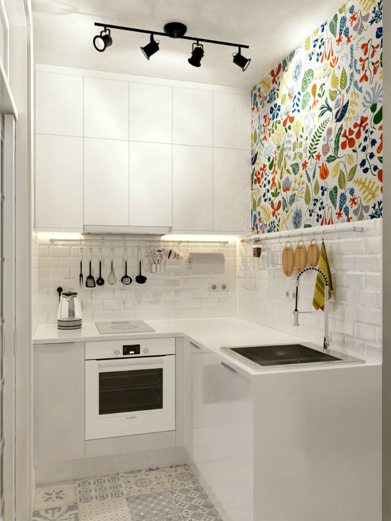
Bright blotches will not reduce the size of the room, but diversify the surrounding space, give it individuality and originality.
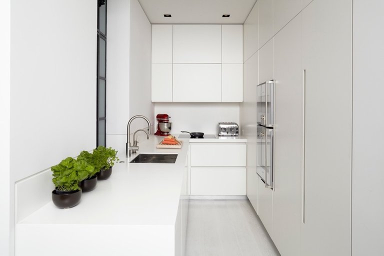
If we are talking about a very small kitchenette, then there is no alternative: white is used both in decoration and in furniture.
Apron for white kitchen
The apron can act as an accent element or not stand out against the background of furniture.
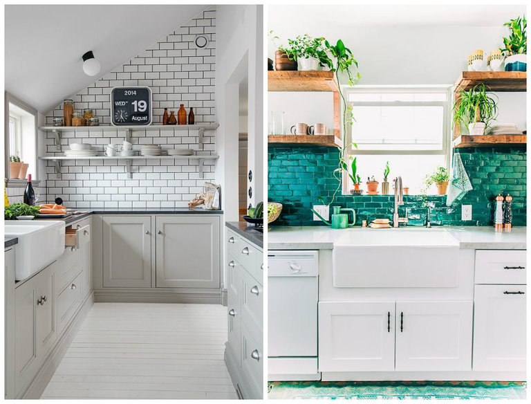
A rather traditional solution can be called “hog” or “metro” tiles. Such a beautiful, elegant and easy-to-clean way of facing will emphasize the sophistication of your idea, will become a wonderful backdrop for wall cabinets. Take a look at these photos, they are taken from absolutely real projects.
The finishing of the working apron in marble will look original. The distinctive pattern will catch the eye and help create a chic design.
Mosaic will also be relevant in this case. The brilliance and originality of the image will be a real decoration.
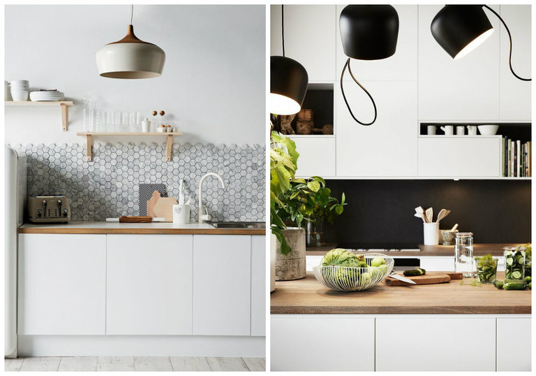
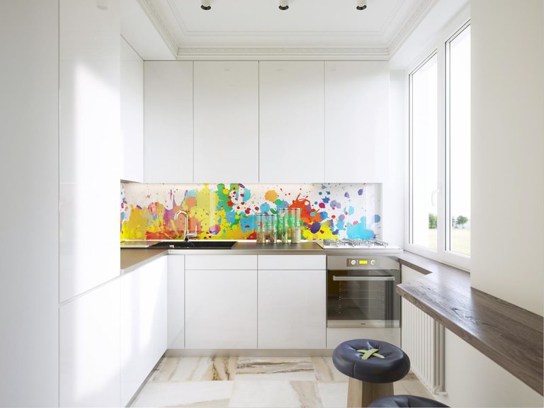
Photo wallpaper placed under glass is another fashion trend in the design of an apron. Having chosen this option for yourself, you can safely abandon the decor, because few people will pay attention to trinkets if they see such beauty before their eyes.
When choosing a material, give preference to one that is easy to clean, resistant to moisture, high temperatures and mechanical damage.
What wallpaper to choose for a white kitchen?
The choice of wallpaper depends initially on the square of the room and the height of the ceilings. With the help of finishing, you can visually adjust the dimensions, make the room taller, more spacious, lighter.
For compact rooms, it is better to choose a wall covering in pastel shades, while a spacious room allows designers to realize an incredible variety of ideas.
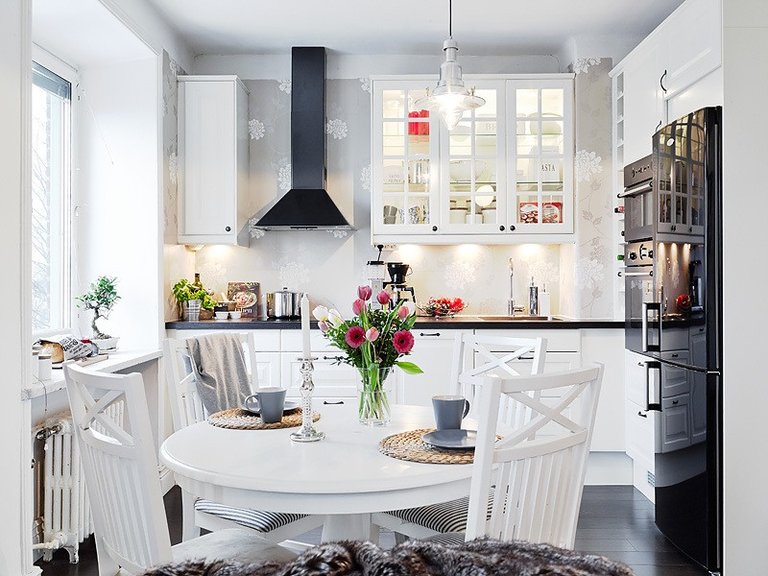
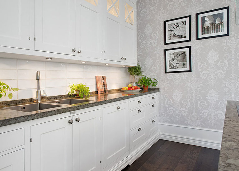
Even at the stage of renovation, you should think about what you would like to highlight in this room: furniture, decoration or decor.
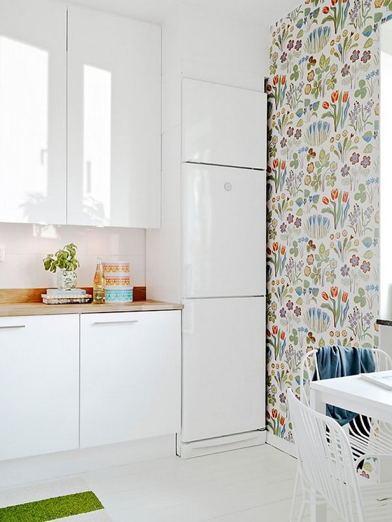
Vivid 3D canvases help create an exclusive accent wall that will attract the eye. It is better to paste over the surface in the dining area with them, because for the most part this is the only plane free from overall furniture.
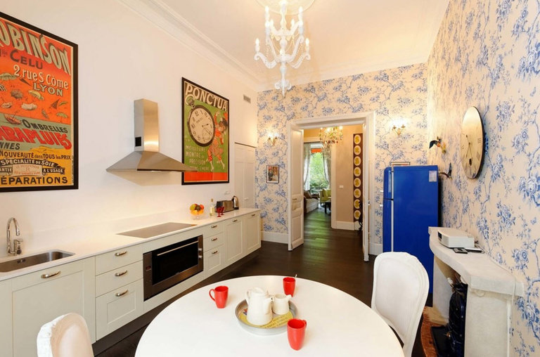
Textured paintable wallpaper will delight you not only with its attractiveness, but also with its practicality. Any contamination that is difficult to avoid in the kitchen can be easily painted over.
Various countertop options
When choosing a material for a kitchen countertop, you should pay attention to both its practical properties and the color scheme. Both light and dark shades of a wide color palette are combined with white.
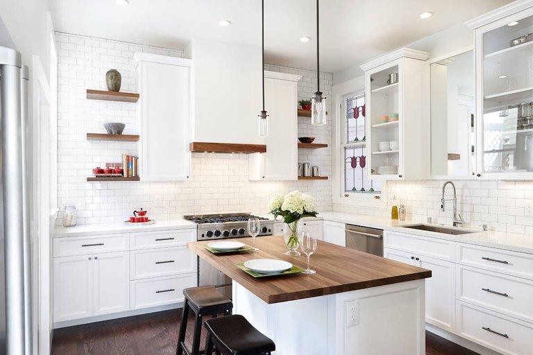
It is important to choose an option that would be in harmony with the surrounding space, complement it and add a touch of sophistication.
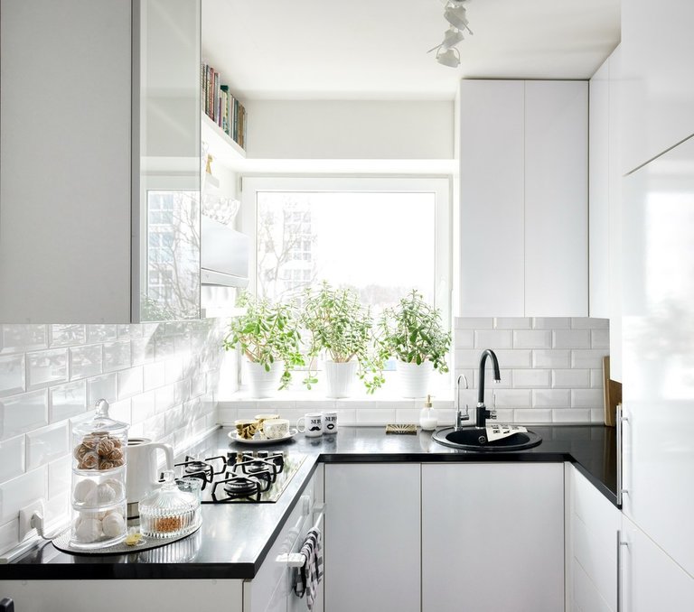
The most popular solutions for such a kitchen today are the following countertops:
- black,
- brown,
- natural wood or imitating the texture of this material;
- white.
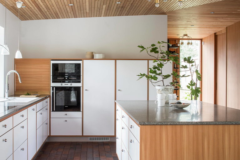
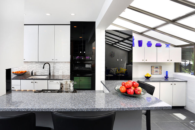
Dark shades can be repeated in the design of the floor and work apron. For small spaces, look for glossy surfaces that reflect light.
Black bottom white top
This solution can be called an interior classic. It does not overload the surrounding space, does not make it too gloomy and depressing.
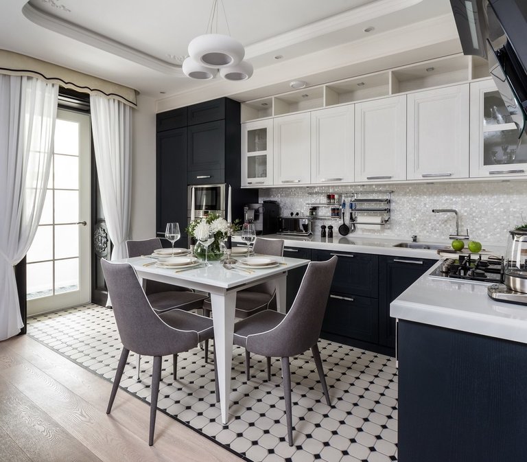
The predominance of a particular color primarily depends on the size of the room. In spacious, well-lit rooms, a black and white set can be complemented by a black dining group.
The dark bottom gives the design solidity and solidity, while the light top brings lightness, weightlessness, airiness. This can be clearly seen in the following photo.
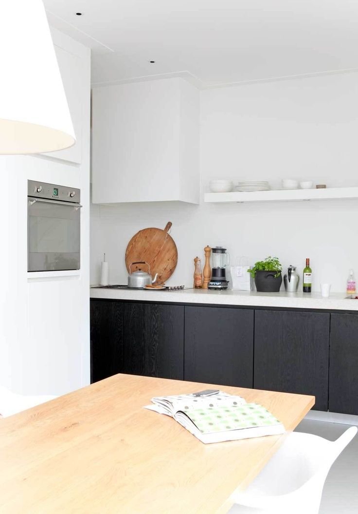
Having opted for such furniture, be sure to take care of good artificial lighting.
Popular combinations
Black and white combinations are far from the only options that have become quite popular in modern kitchens. Such color combinations are also in demand among designers and ordinary consumers:
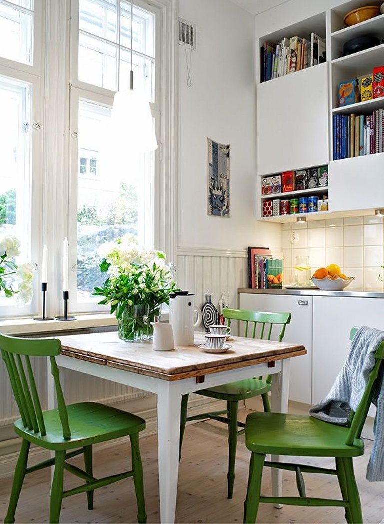
- white-green,
- white-purple
- blue and white,
- white-brown.
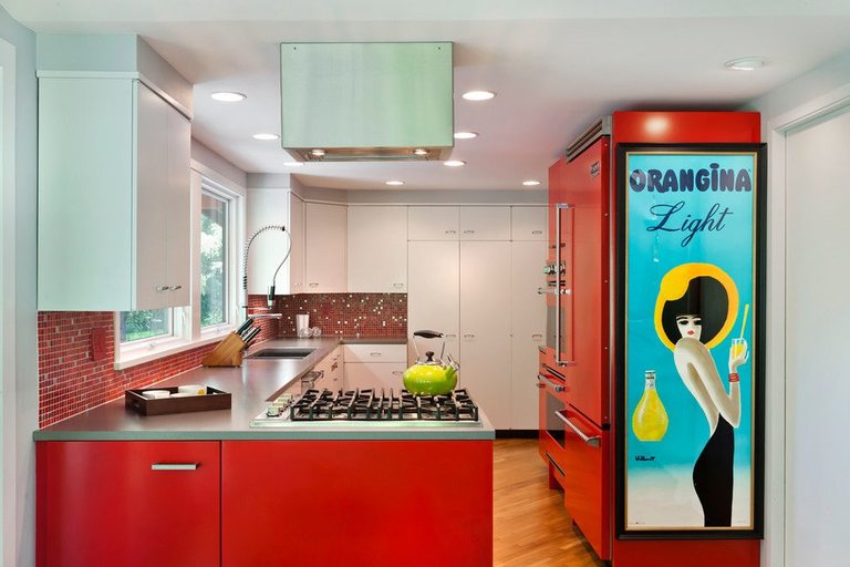
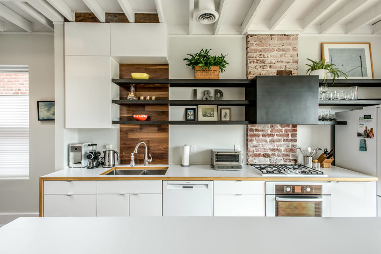
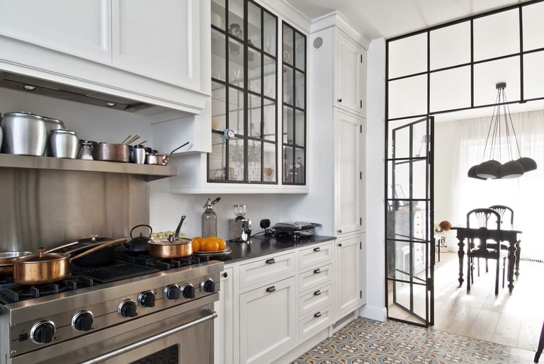
In the selection process, one should proceed from the given style, as well as personal preferences.
Designer Tips
Light wall decoration in combination with snow-white furniture will somewhat tire the eye. To avoid this, several accent details should be selected. It is on them that the eye will focus. A couple more photos.
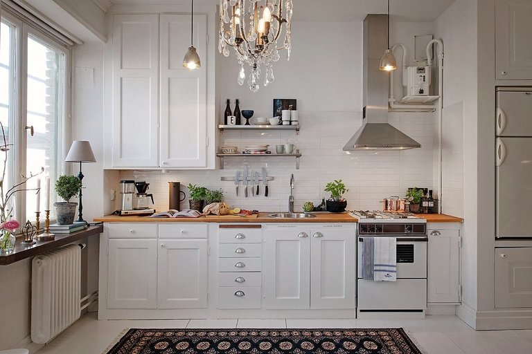
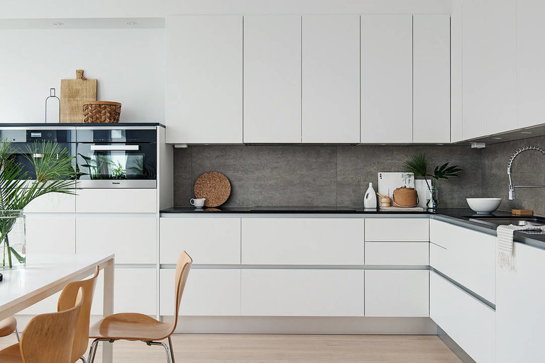
Such elements can be lighting devices, small household appliances, dishes displayed on open shelves, upholstery of chairs, curtains or garters.
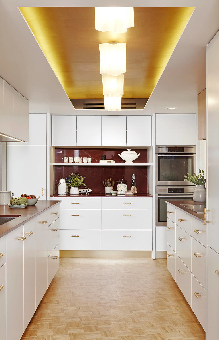
Chrome surfaces will perfectly complement modern designs: minimalism, hi-tech, etc. Metal can be dishes, accessories, facades of household appliances.
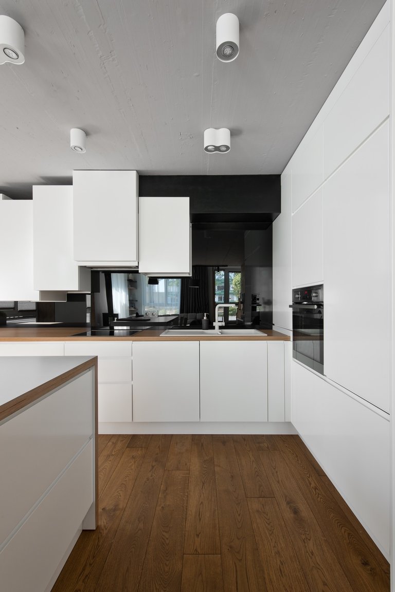
Natural wood and glass will look spectacular in a white kitchen. Several bright decorative elements will be appropriate: flower pots, salt and pepper shakers, potholders and towels.

