Welcome to our latest post photo + 10 tips how to arrange it conveniently
.
The only exceptions are studio apartments, where the kitchen is not intended for eating, which means there is no need to place a table with chairs there (in this case, it is in the living room), and this, in turn, means that there will be enough for cooking. small space.
1. What is a U-shaped kitchen?
2. pros
3. Minuses
4. Examples in the interior
five. Choice of colors
P – layout
This is a kitchen that has three sides and, if you look at its top view, we will see the letter P.
You can arrange these sides as you like. Any walls can be used, including those with a window. True, in standard apartments this option is rather problematic, since the level of the lower edge of the window, as a rule, is lower than the standard working height of the table top.

But, there would be a desire! The window can be raised and it is not so difficult. Another question: is it necessary? Let’s figure it out, since this layout has both advantages and significant disadvantages.
Why is this layout good?
The first – it is beautiful and fashionable. Perhaps this is the most important thing that can be identified as an asset.
If we say that this is too functional and convenient, then this would be an exaggeration, since a U-shaped kitchen is no more convenient than a standard L-shaped one.
Second – in this version it is possible to make many, many drawers and cabinets. Moreover, a big plus is that closed boxes can be placed only at the bottom, and the upper tier can be left open and equipped with shelves and decor: there is still enough space for utensils.
On this, perhaps, the advantages are exhausted.
What are the disadvantages?
Now about the cons. Let’s make a reservation right away, all of the following does not apply to those who have unlimited budget and space. This is written for those who really want something original, but finances are tight, and the size of the kitchen leaves much to be desired. So…
First of all, this is very expensive, since there are no standard headsets of such a layout and more materials will be needed to make it.
Secondly, in typical apartments, as a rule, there are discrepancies with a window, which, as luck would have it, is always located opposite the wall with the front door (that is, the one that cannot be used in the trio).
Yes, you can, of course, include a wall with a window in the project, but this entails inconveniences: you will no longer come close to the window! How to wash it then, at least? How to insert mosquito nets?
Thirdly, a kitchen of this kind requires a large area. If you try to squeeze it into the standard 9-10 squares, you get one frustration. Instead of a spacious room, which could be equipped with an L-shaped headset, you will get a kind of trailer, in the middle of which a dining table barely fits.
Naturally, cooking in such cramped conditions is not at all convenient. Dine too. And to do both together (that is, it is with the whole family, when someone is at the stove, and someone is at the table) is completely unrealistic.
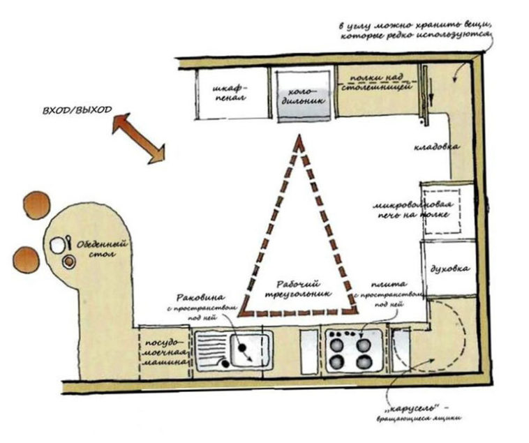
Fourth, U-shaped kitchen has two “dead” corners (turns). And this means that they need to be equipped with special fittings (for example, drawers-turntables) so that these places do not “walk”. And there are such “chips” – expensive. Even very expensive. They also break down quickly.
So, our advice to you: start not from the pictures in the magazine, but from the real cubic capacity.
Count it. Keep in mind that the desks are at least 70 cm wide, and do not forget to add another 30 cm for opening the drawers.
That is, if you have a kitchen with a total area of 9 squares, with a width of only 3.5 meters, and you “steal” a meter from both sides, what will you have left? Only 1.5 meters! There can be no talk of any table here.
Of course, you can build some semblance of a table from the third side of the kitchen. But what is the point, again, again?
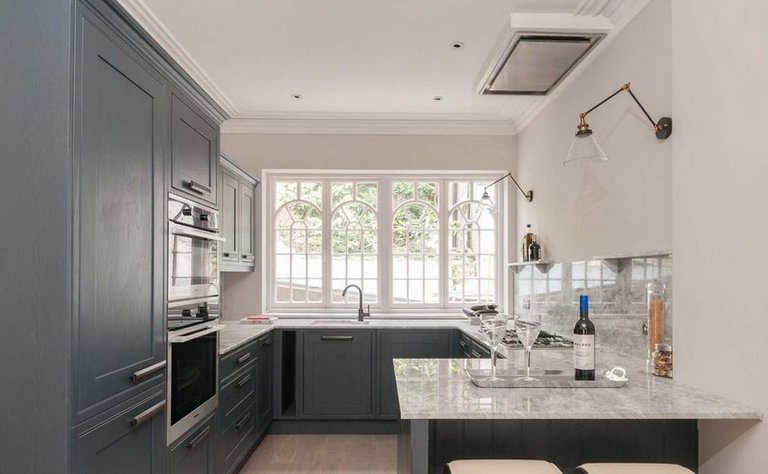
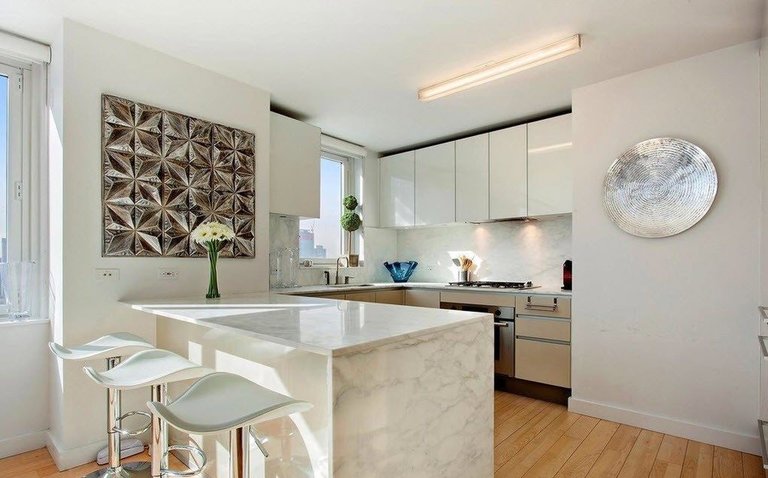
But let’s not talk about the sad. Let’s still see what kind of U-shaped kitchens there are and maybe some interesting idea will visit you.
Design options
There are a lot of them that the eyes run wide. We advise you to start with the size of your kitchen, budget and style preferences. Some of the options are more modern, while others are, on the contrary, more classic. In any case, there is plenty to choose from.
More than 12 squares
12 sq. m. is already something. This cubicle will fit everything you need: three side parts of the headset and a dining area.
One side, for example, with a built-in refrigerator, microwave, washing machine and other appliances.
The other is reserved for a work area with a tabletop and a stove (panel). The third side is for desktop equipment: bread maker, meat grinder, etc. Very convenient, no doubt about it.
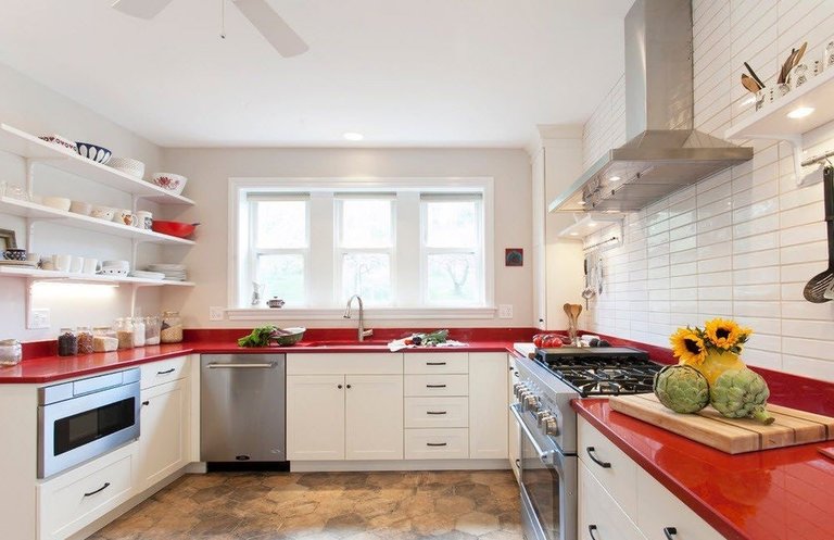
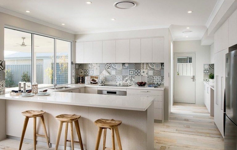
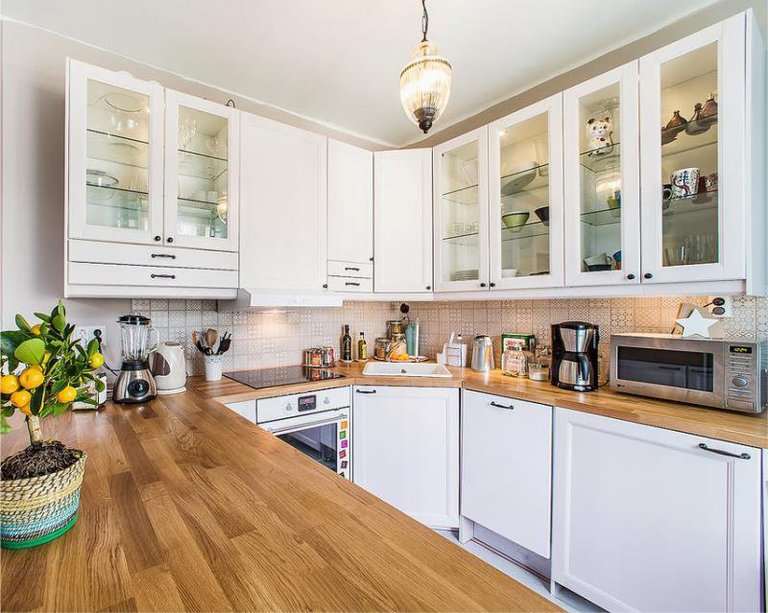
Now, probably, only the lazy has not heard about what is “Working triangle” in the kitchen.
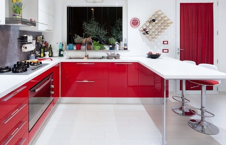
But for those who don’t know, let’s explain: this is the arrangement of the three fundamental things in the kitchen: refrigerator, sink and oven. That is, in theory, the sink with the oven should form two corners of the triangle, and the refrigerator should form the third.
What is the convenience here – to be honest, it is not very clear. Why should the refrigerator be exactly opposite the sink? Or stoves? It would be much more convenient if the refrigerator was next to the countertop and it does not matter at all whether it is all a triangle or not. But, since the designers say so, then it is worth listening to them and admitting that in a U-shaped kitchen this law is extremely easy to comply with.
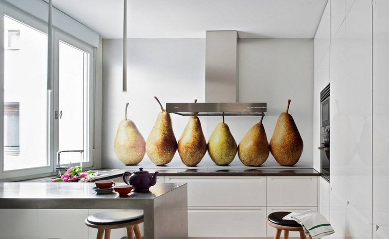
Here, look at the photo below. We have selected real photos of kitchens, about 12 squares in size.
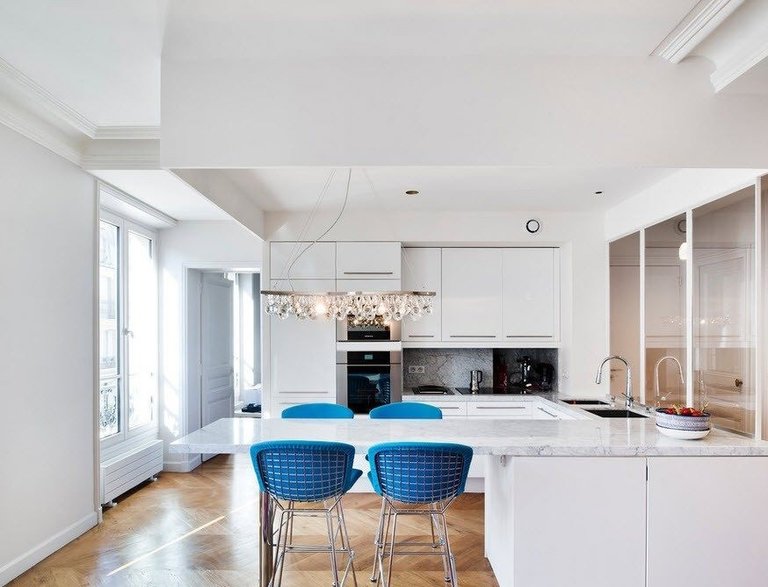
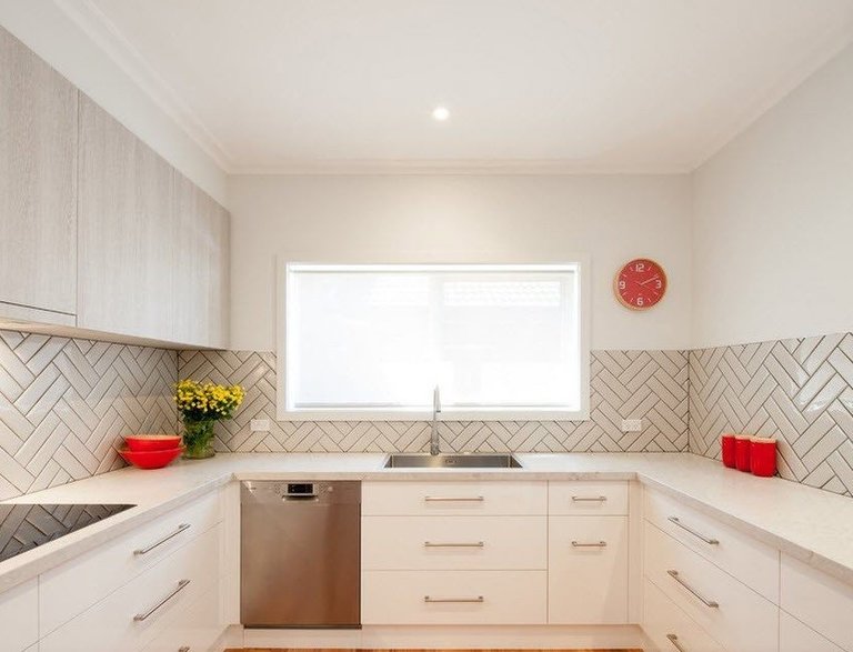
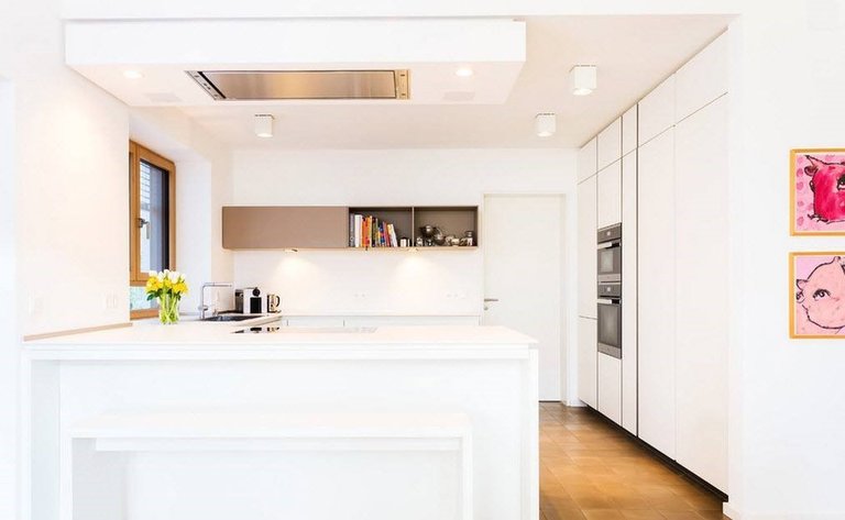
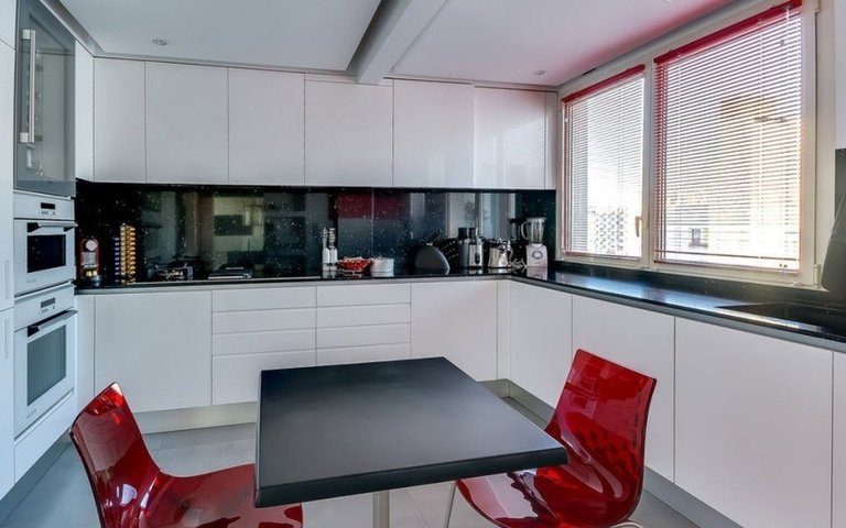
U-shaped kitchens with an “island”
Kitchens with an “island” are already for very large rooms, starting from 20 square meters. Even on 18 squares, the island will look doubtful, since, in order to be “in place”, the distance around it must be at least 1.5 meters in a circle.
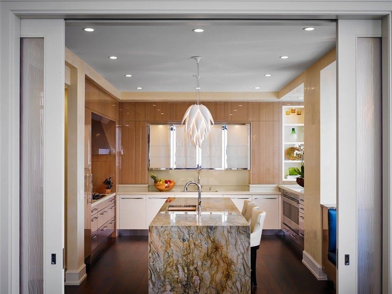
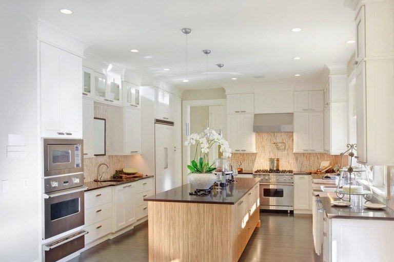
“Islands” are different: square, rectangular, rounded. They can be used as an additional work surface, or as a dining area.
A very interesting option is a two-tiered, retractable “island”. The upper part is about 90 cm, and the lower one is 76 cm. At a higher level, it is convenient to cut something, and at a lower level, knead the dough, for example.
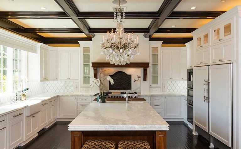
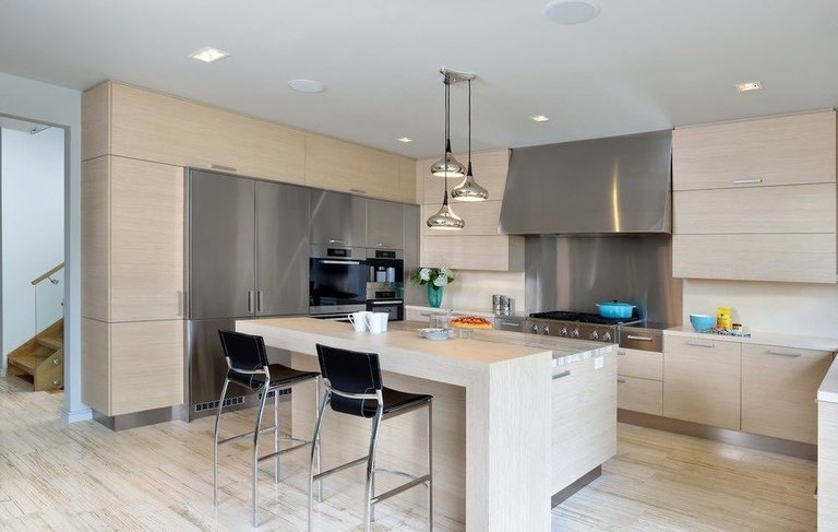
You can often find photos showing “islands” with a built-in sink. We cannot agree that this is convenient, since there is no wall cabinet nearby and it is inconvenient to put the washed dishes right on the surface.
In general, the “island” is more a decorative element than a functional thing. It is designed to take the empty space that remains in the huge kitchen.
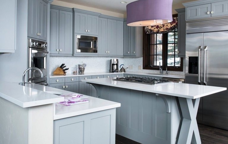
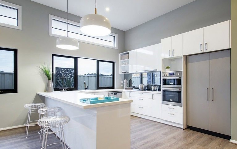
All sorts of decorations look very good over it: copper pans, for example, and other old utensils.
U-shaped kitchens in studio apartments
As we already wrote above, small U-shaped kitchens are acceptable only in studio apartments. Yes, in this case, even with a cubic capacity of 6 squares, a very decent interior can be organized.
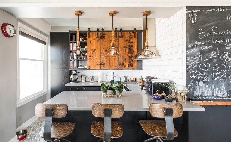
The third side here, simply, is taken out to the place where there was once a wall between the living room and the kitchen. Naturally, there is usually no top level in such a kitchen, but it is not even needed! In order to place dishes and small appliances, the cabinets below are quite enough.
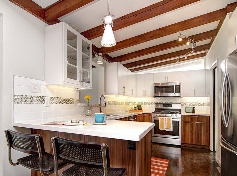
Of course, such a layout is possible if the wall to be demolished is not load-bearing, since it will have to be destroyed to the ground. But, unfortunately, projects of standard apartments on the secondary market, in 80% of cases, have just a bearing plate between the kitchen and the living room.
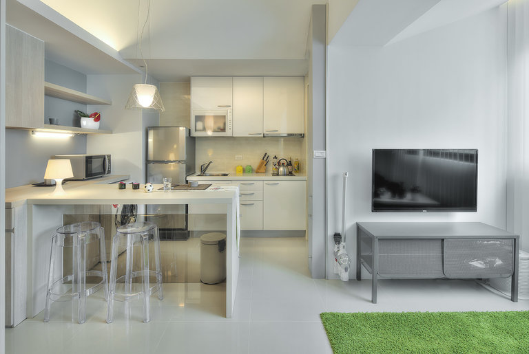
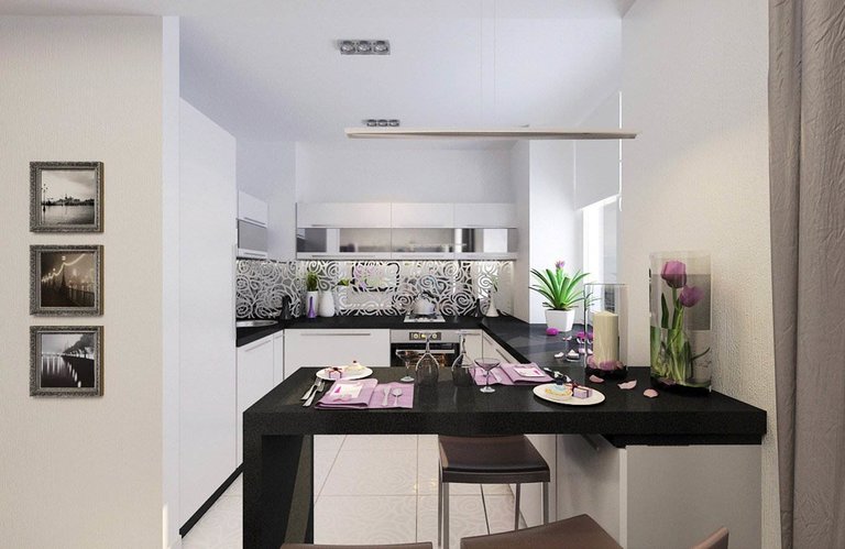
If you find yourself in this small percentage of lucky ones, then a kitchen in the form of the letter P combined with the living room will be an excellent option. But, anyway, before you demolish the wall – make a drawing and calculate everything to a centimeter.
With bar counter
The bar counter is a good option for the third side of the kitchen if you do not want to put a separate table and chairs there.
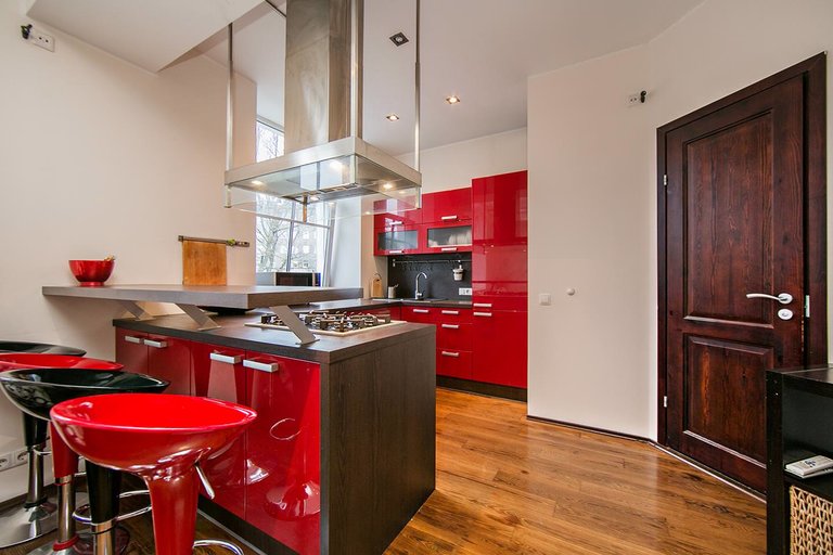
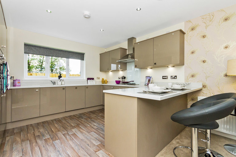
This is convenient, but if you have a very small family or, in the living room there is a separate area for family gatherings. If this is not your case, then don’t look at fashion, look at practicality.
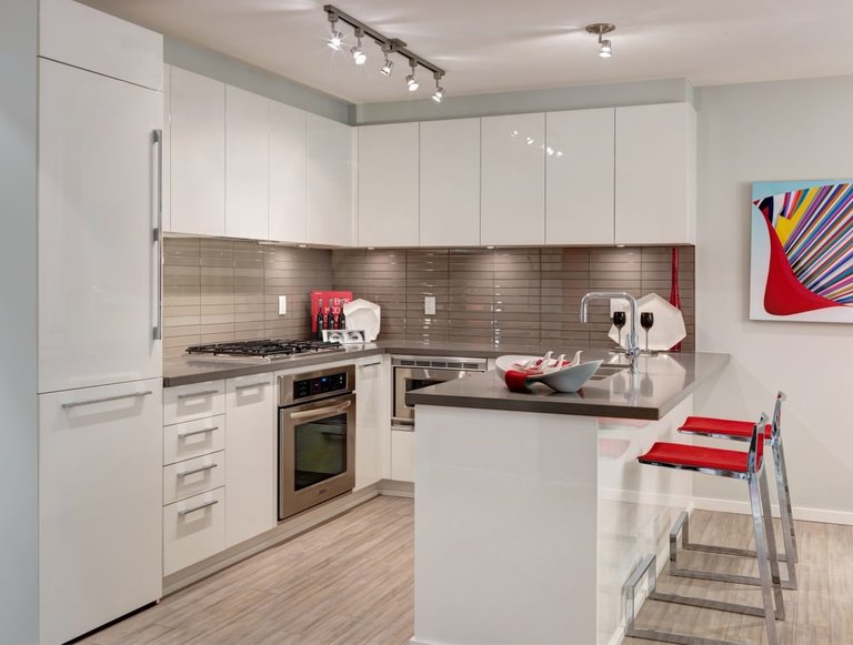
Even if your bar counter is two meters long, then three of us will not be very comfortable to sit behind it. Rather, having a snack is quite normal, but for special occasions when guests come, such an arrangement will seem strange and uncomfortable.
U-shaped kitchens with an involved window
If you do not want to listen to us and still dream of placing a tabletop under the window, then at least observe the following conditions:
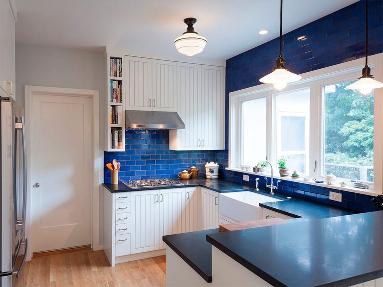
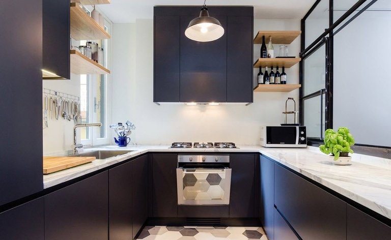
If there is a radiator at the bottom, then it is better to abandon this idea, since the deaf countertop will block the heat flow upwards and it will become much cooler in the kitchen.
If this does not bother you, then at least make gaps in the countertop through which air will pass. Yes, in this case, it will be inconvenient to use this particular piece of surface for cutting, since food may fall in the gap, but it will not be cold anymore
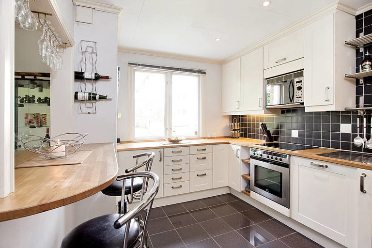
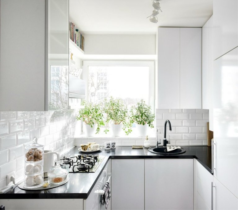
You should not “take out” the sink to the window. No matter how beautiful it looks in American films, keep in mind that their window heights and widths are slightly different. And due to this, the spray does not fall on the glass, does not reach it. If, in the case of a typical apartment, you take and raise a window in order to equip a mini-apron under it, then it will be much smaller than necessary and the natural lighting of the kitchen will come out gloomy.
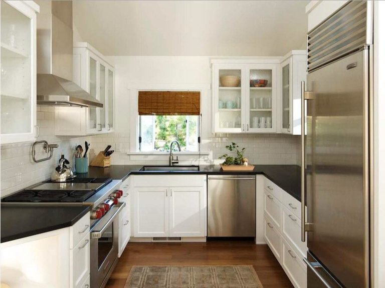
And lighting in the kitchen is the most important thing! Let it be better to have fewer surfaces than it will be difficult to see.
With adjoining sofa
Three-sided kitchens look very interesting if you put a corner sofa with a dining table on the edge of one of the sides.
For example, it might look like this:
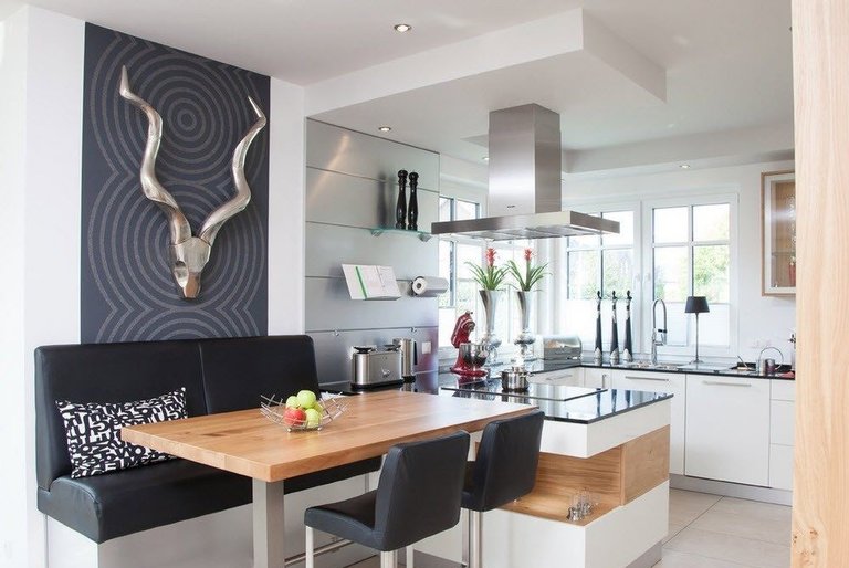
True, there is also an inconvenience. Those who are sitting at the table will be very uncomfortable talking with those who are cooking at this time.
Again, in this case, the TV cannot be placed comfortably for the diners and the “cook”, since the cooking surface in this picture is in the opposite direction. Would you mind slicing food right over the heads of those on the couch?
Anyway, this solution is not functional. What can you do on that piece of countertop? Just drink coffee carefully, no more, because any cooking will certainly stain the upholstery of the sofa (or the head of a peacefully dining household).
Style solutions
We’ve discussed all kinds of layout options, and now let’s talk a little about style.
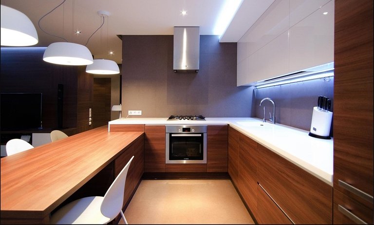
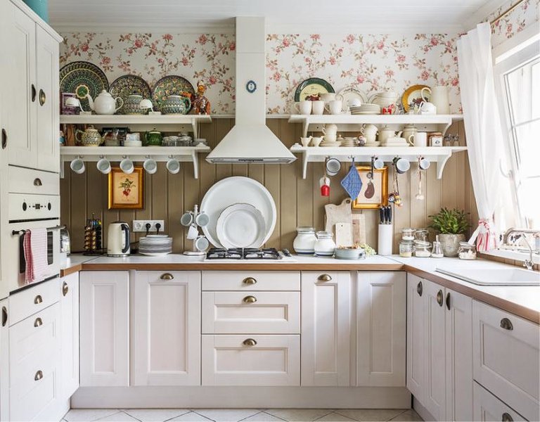
In general, this type of furniture arrangement is suitable for almost all directions. A U-shaped kitchen will be good in a modern style, and in a classic style, and in the now fashionable Provence style.
The only style that will not look very good in a three-sided version is country. Well, it will not be natural, period. The “island” stylized as a “village” will look especially ridiculous …
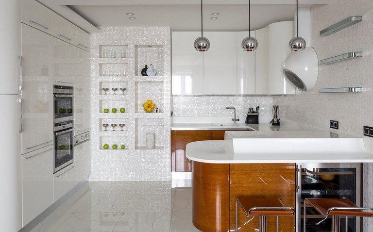
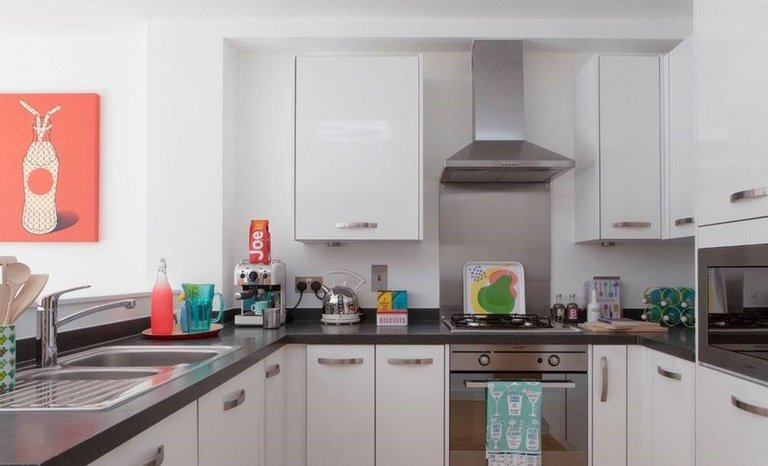
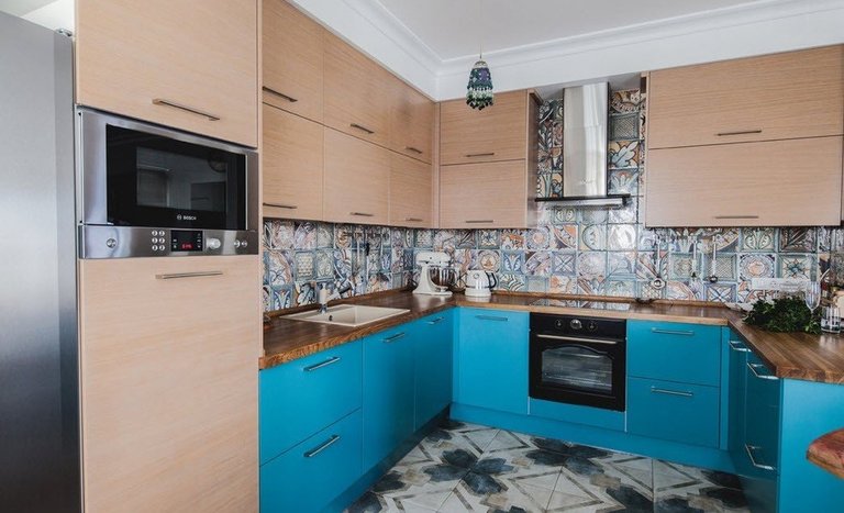
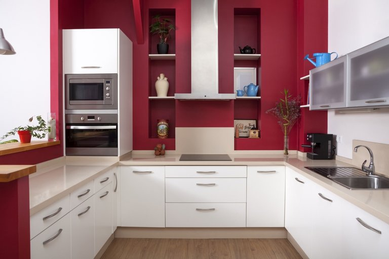
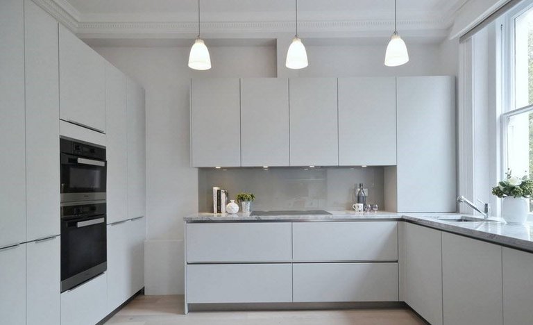
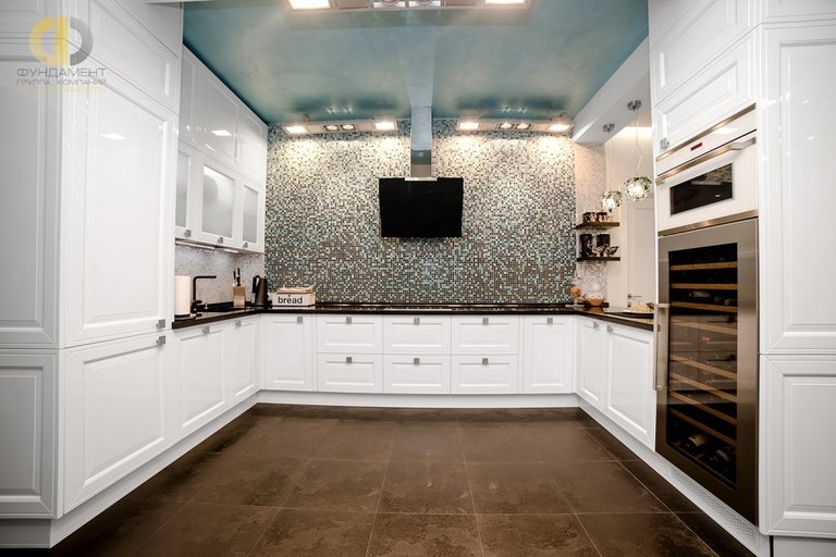
Look at the photo below, we have selected the most successful options for U-shaped kitchens (in our humble opinion, of course).

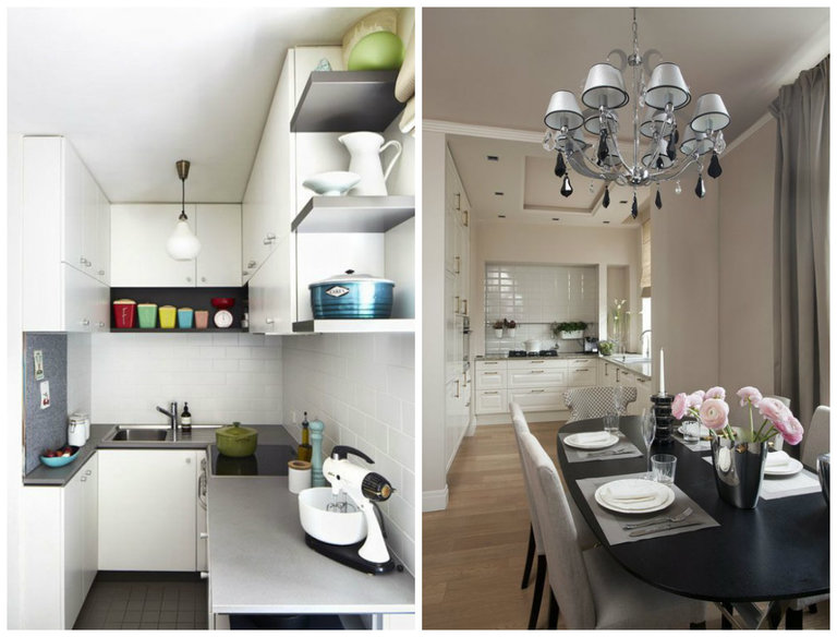
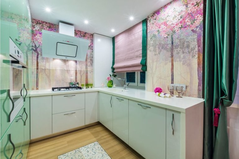
What’s the best color for these kitchens?
If we say that any color is good for such a kitchen, then this will not be an exaggeration. By itself, such a layout assumes space, and where there is space, everything is possible!
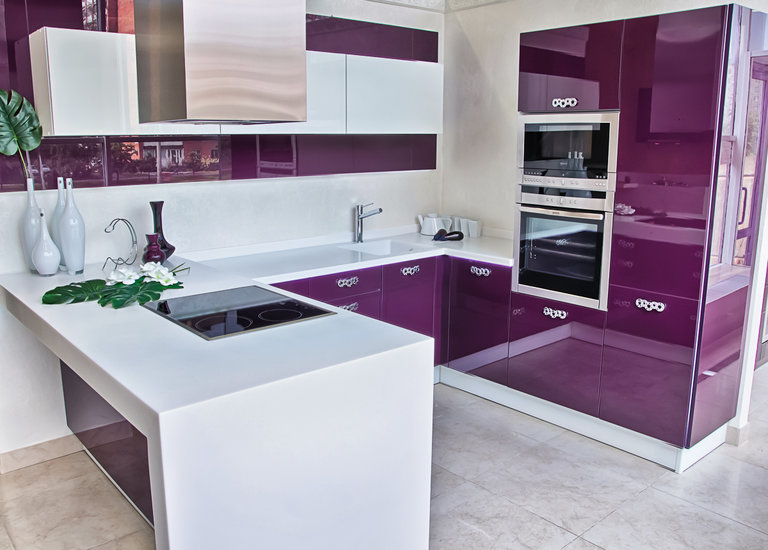
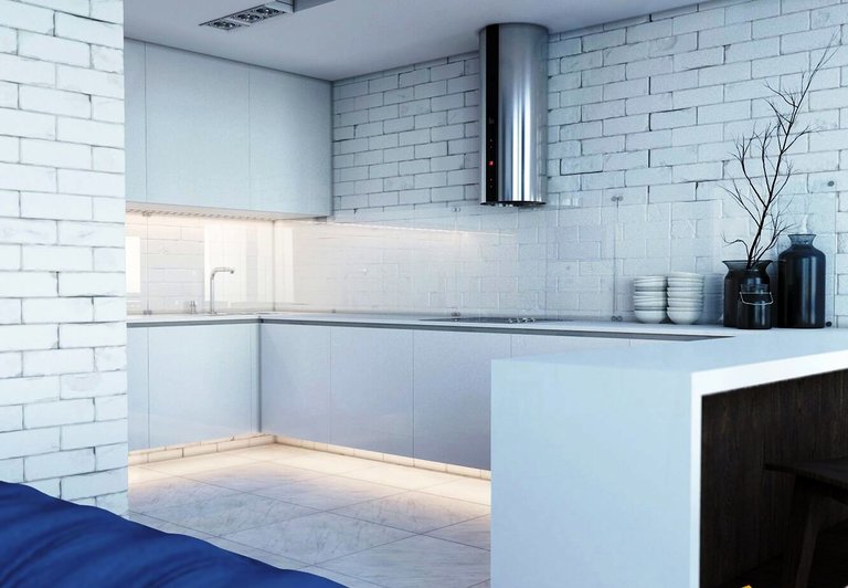
If you make the main cabinets white, then the room will look huge. But in this case, it will be necessary to dilute the whiteness with colored textiles or a bright apron over the working area.
If you make the cabinets bright, then on the contrary – leave the walls neutral. In general, there are no special recommendations here and cannot be.
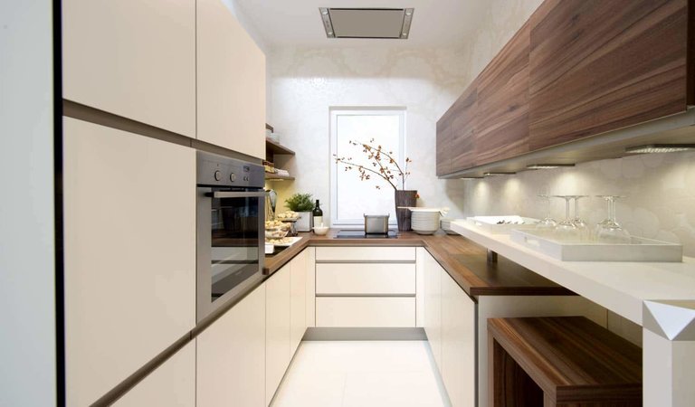
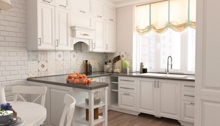
The only thing is, do not make a common mistake: do not make the “island” from a different material than the main cabinets. In this case, it looks ridiculous, not interesting, and besides that, it visually “steals” the area.
You can often see photos showing a kitchen set made of white plastic, for example, and the “island” is made of stone, in the color of the countertops. It looks ugly. “Island”, ideally, should exactly repeat the texture of the facade.
Or, there are far worse decisions. Kitchen furniture is paneled, and the “island” is made of stainless steel! In this case, it looks like a surgical table, and not an element of the setting. Even if it matches perfectly with any household appliances or refrigerator.
In conclusion, I would like to say: remember that in u-shaped kitchens, each component must be combined with each other, otherwise the room will look large, but disorderly.

